
Overview
I built "Save Places" — one of the app's core features — based on user research and data analysis.
Planning research
Goal
My goal was to focus our efforts on the features that would make the app more useful and appealing to users.
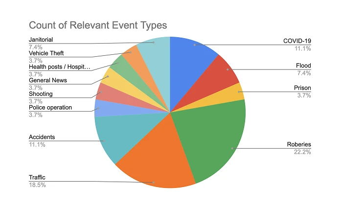
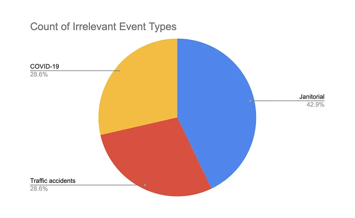
I wanted to find out which event types were relevant enough to show on the map and/or trigger alert notifications.
Target group
These interviews focused on the app's most active users. I wanted to better understand the profile of people interested in our product — when they used the app, how often, and why.
Interview questions
- What do you do for a living?
- How did you find out about Civi?
- How has your experience with the product been so far?
- Has the app ever crashed for you?
- Do you feel safer with the app?
- Have you been receiving notifications from Civi?
- What event types do you think are relevant for you? Why?
- What event types do you think are irrelevant? Why?
- Is there any functionality you would like the app to have?
User interviews
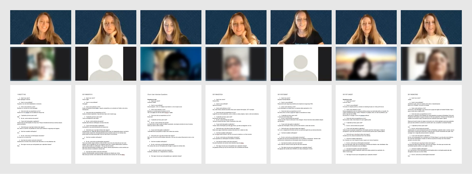
I interviewed about 15 active users for around 10 minutes each, and documented each session's questions, replies, and key insights.
Data compilation
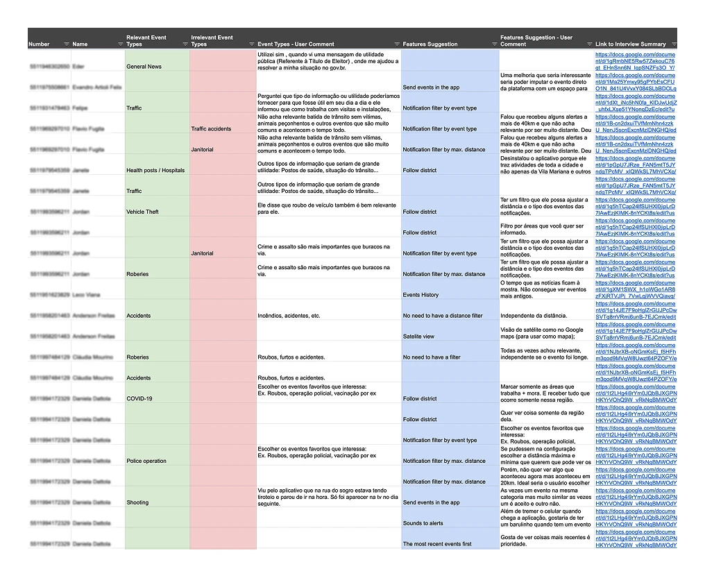
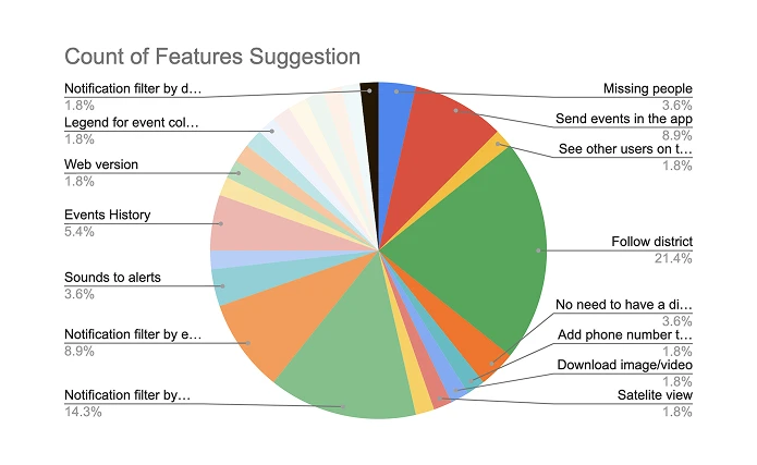
From the interview notes, I built a spreadsheet summarizing the key insights, feature suggestions, and relevant/irrelevant event types, then turned it into three charts to visualize the patterns.
Data analysis and conclusion
The interviews showed people cared about their loved ones' safety as much as their own — they wanted visibility into their homes, workplaces, and other frequented places, and a way to confirm that family and friends were safe.
Over 23% of interviewees also wanted to filter notifications by maximum distance or event type, frustrated by alerts that felt too far away or irrelevant.
That concern showed up most clearly in an "Alexandre" persona — someone who works in deliveries and spends the day on the streets, away from his family and feeling responsible for their safety.
He needed to keep an eye on the places that mattered most to him: home, work, his kids' school. Other users shared the same concern to a lesser degree, which is what pointed me toward building a feature to monitor specific places — "Save places".
Interactive prototype & user test
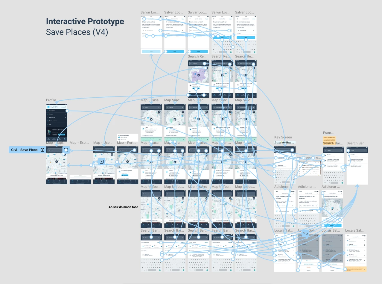
Before committing to development, I validated the idea with a larger group of users through a survey. Once that confirmed it was worth building, I built an interactive prototype to test with users, which let me apply improvements and fix issues before shipping to production.
I also tested the prototype on a very small device on purpose. Looking at our data, I noticed a large number of users were on old phones with small screens, which was cutting off important information. Many users were also older and used larger system font sizes, which made the experience worse in the same way. From this point on, I started designing and testing on small screens with these limitations in mind, to make the app more accessible.
Try the interactive prototype or open it in a new tab →
Breaking the feature into smaller versions
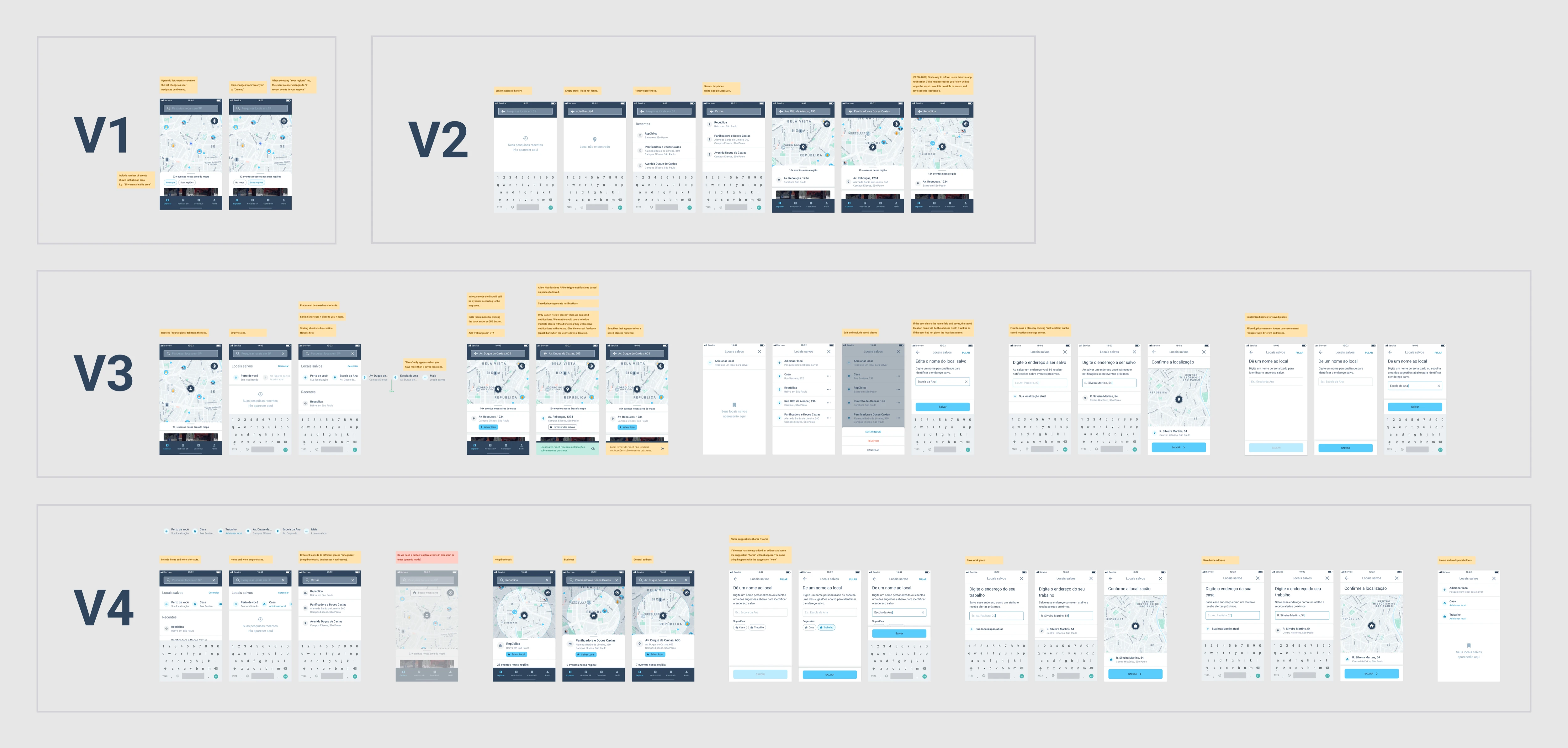
I broke this feature into four smaller versions, which let us launch faster and validate with users throughout implementation.
"Save places" final version
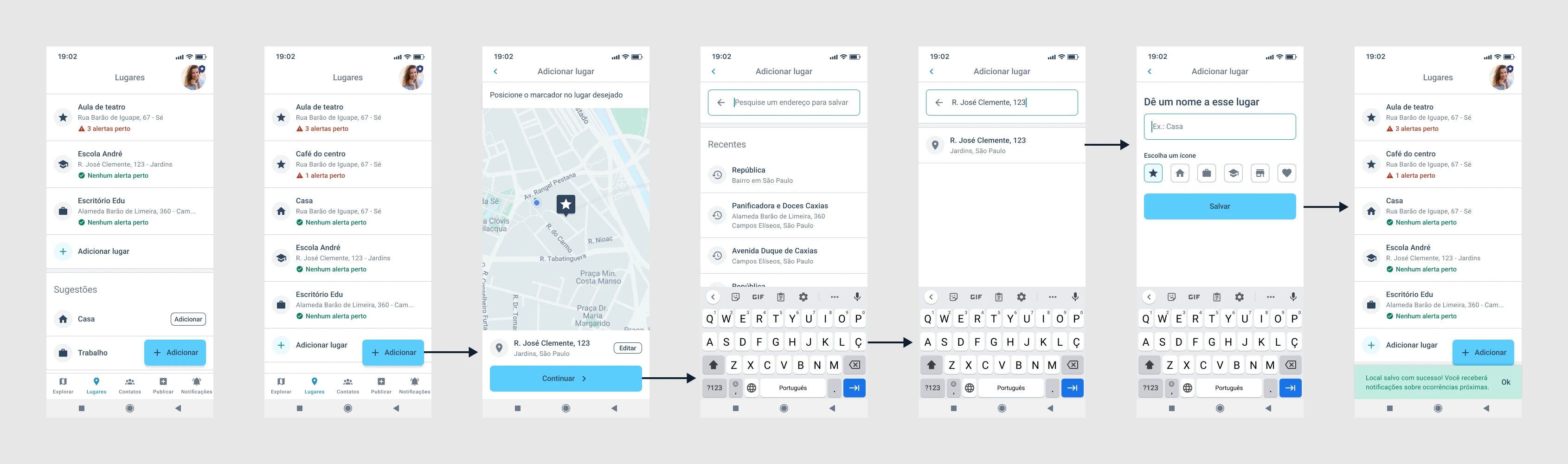
After a few rounds of improvements, I landed on the version below.
Results
I measured success by the number of places saved per user, the open rate of notifications for events near those places, and overall engagement. I rolled the feature out to a select group first to gather feedback and make adjustments before the full launch.
Adoption was fast, helped along by an in-app launch modal — most users marked at least one place of interest. Over 60% of saved places were named "Home" (or a variation of it), which said a lot about what people were really worried about.
More than 30% of active users added at least one place, averaging 1.6 locations per user, and the notification open rate for these places held up close to the rate for general nearby-danger alerts. Weekly-cohort retention rose by about 3 percentage points per week, and events viewed per active user per day grew by about 8%.
One wrinkle: after launch, we ran into duplicate notifications, which took a fairly complex technical fix to resolve. Given the engagement gains, it was worth the effort.
See also
You can also check out the Design Sprint we ran in 2022, where we created a feature that let users invite friends as safety contacts.