
Context
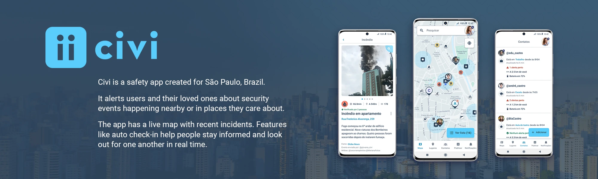
Civi believes safety is a right for everyone, and aligns information and technology to help individuals and communities stay better informed and safer.
Co-founded by Carla Vass and Vanessa Muglia, Civi launched publicly in São Paulo, Brazil in June 2021, backed by a R$10.2 million pre-seed round led by Canary, with angel investment from the founders of Nubank and iFood.
The platform delivered real-time notifications about nearby crimes, fires, floods, and traffic incidents — sourced from both an internal ops team and the app's own user community. Civi's goal was to become the number one security app in Latin America.
Registered users
Urban incidents submitted, totaling roughly 20,000 monthly real-time notifications
Raised in pre-seed funding, led by Canary
Team size at Civi's peak, across more than 3 years
Check the pitch decks I designed to know more about the company on Civi — Brand & Communication →
Measuring success
Civi's value came down to how relevant and easy to consume its information was — the more relevant and consumable, the more users engaged. The three top-level metrics I used to track this were:
I led the conception and execution of several features aimed at improving these metrics — two of them, save places and the event submission flow, have their own case studies below, with the results they drove.
- DAU/WAU and DAU/MAU, to measure how often people came back — and how present the app was in their daily lives.
- Events viewed per active user per day, to see whether active users found the published events worth their attention.
- Retention of the user base by weekly cohorts (the inverse of weekly churn), to know whether the app kept delivering on its promise in the short and long term.
First wireframe
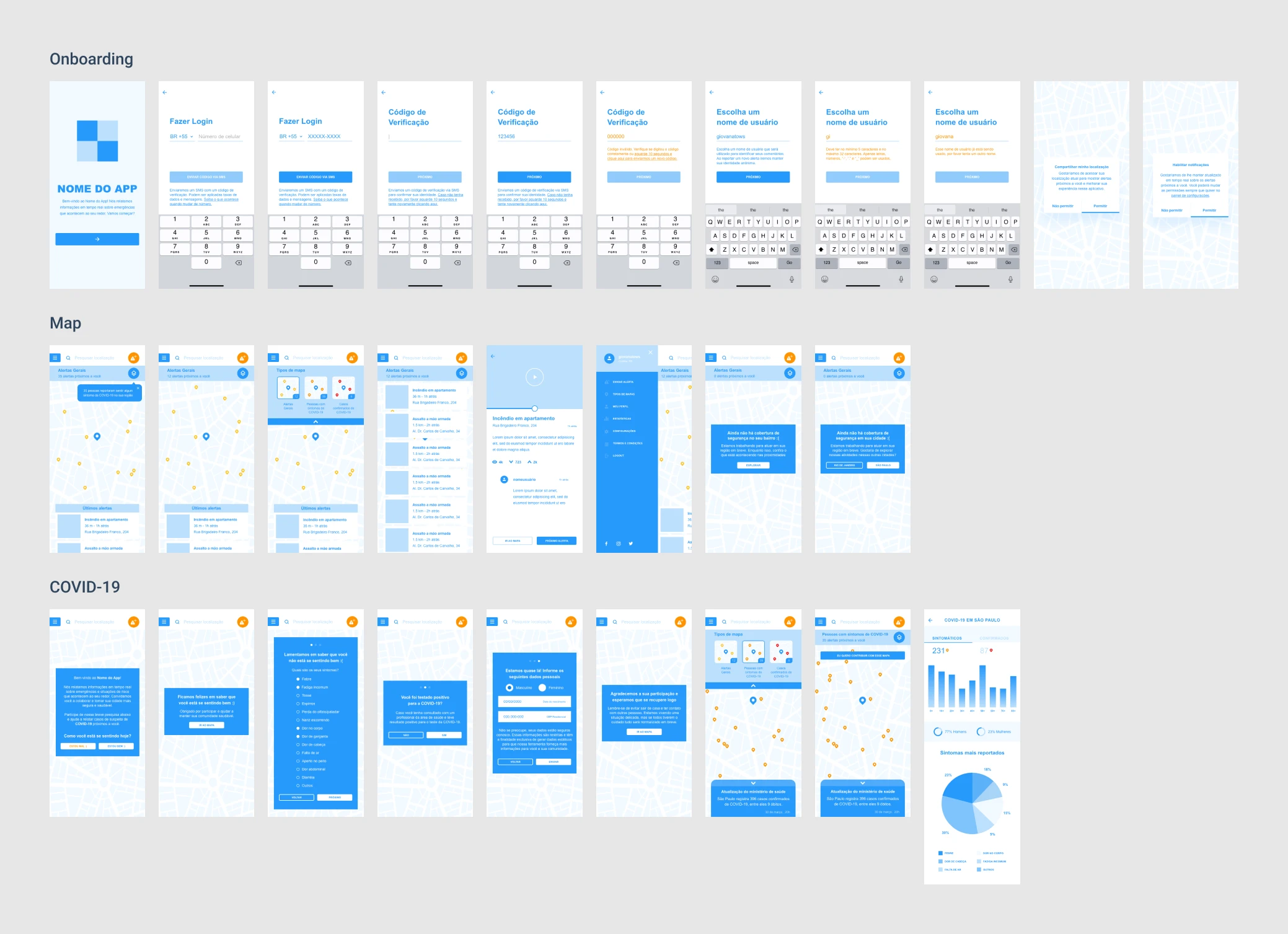
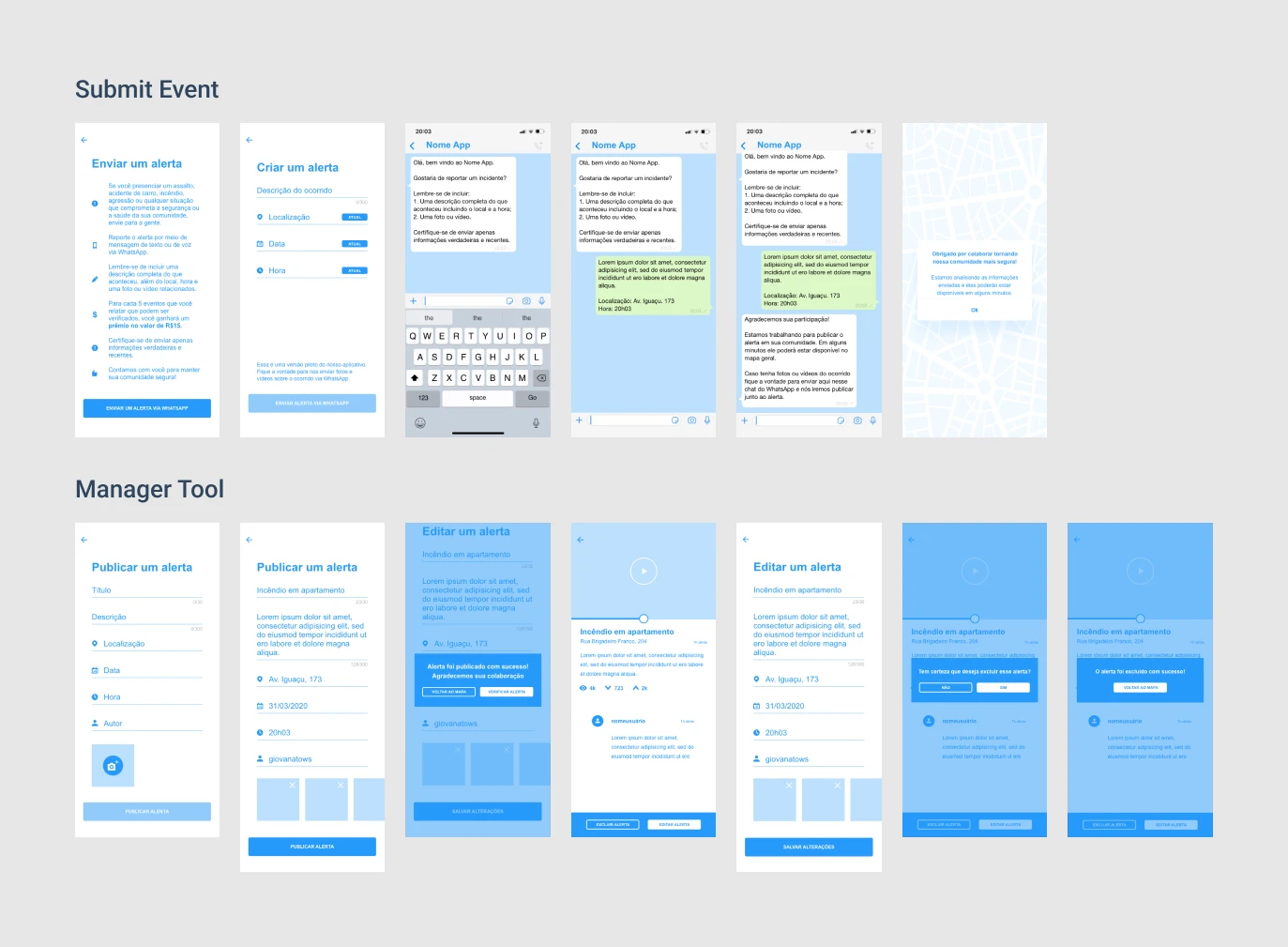
I made Civi's first wireframe in 2020, based on a sketch the founder made.
The goal was to build an MVP and launch fast.
That first version included a COVID-19 tracker, which was discontinued around 2021.
Interface overtime
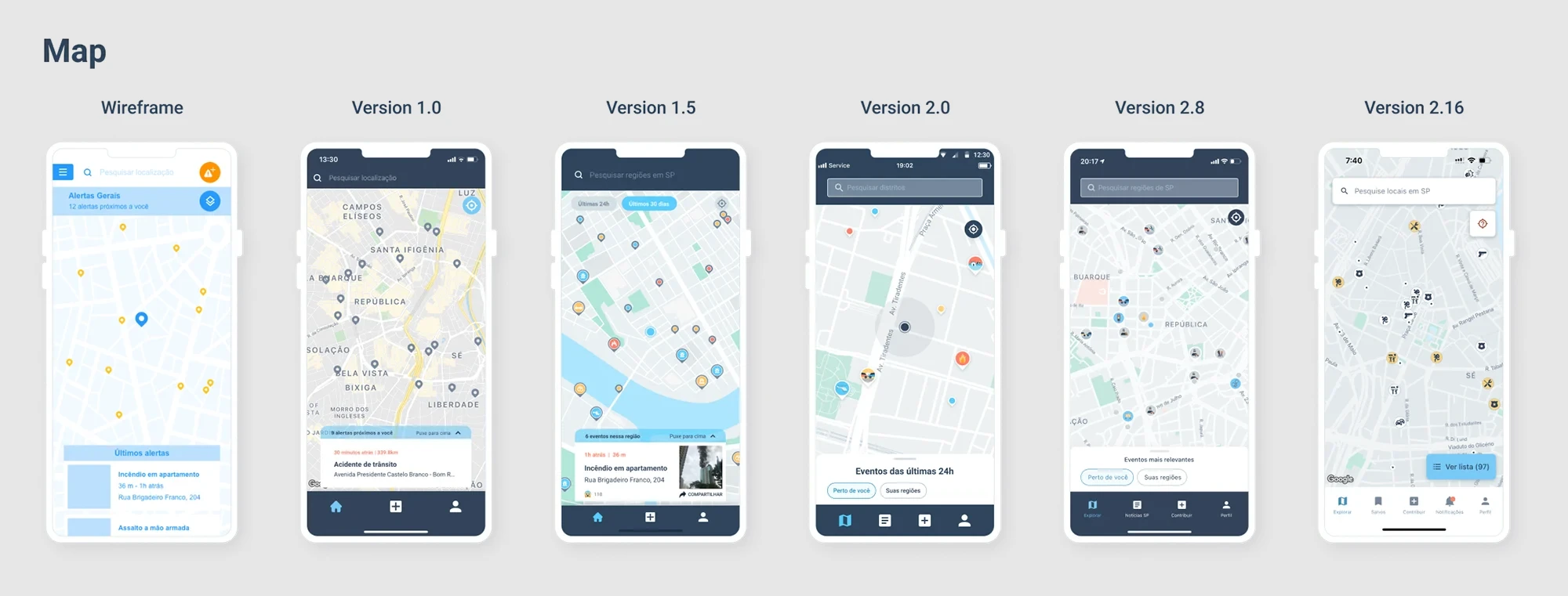
Between April 2020 and September 2022, I took the app from MVP to a fully functional product — here are a few key moments from that evolution.
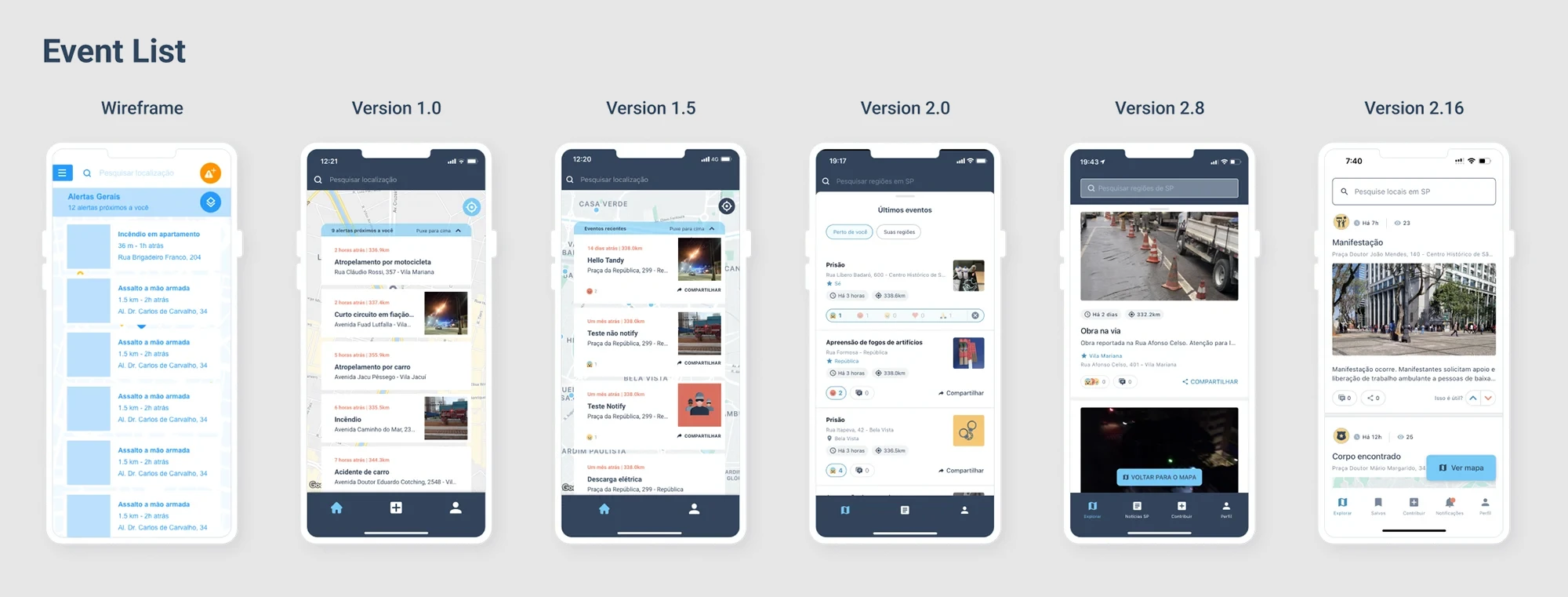
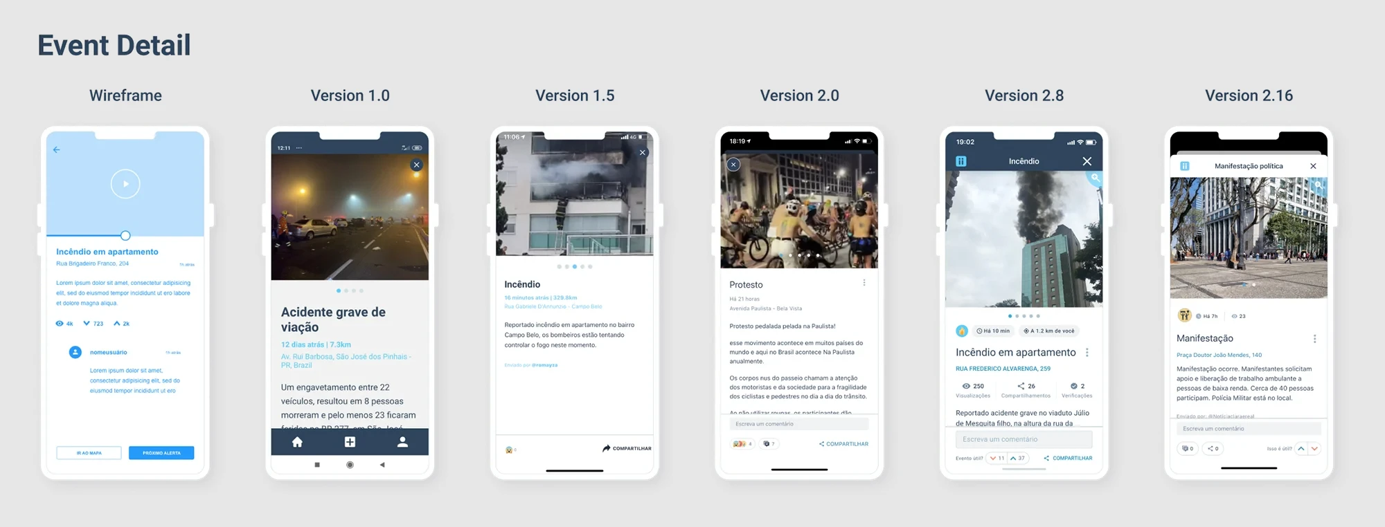
Main functionalities
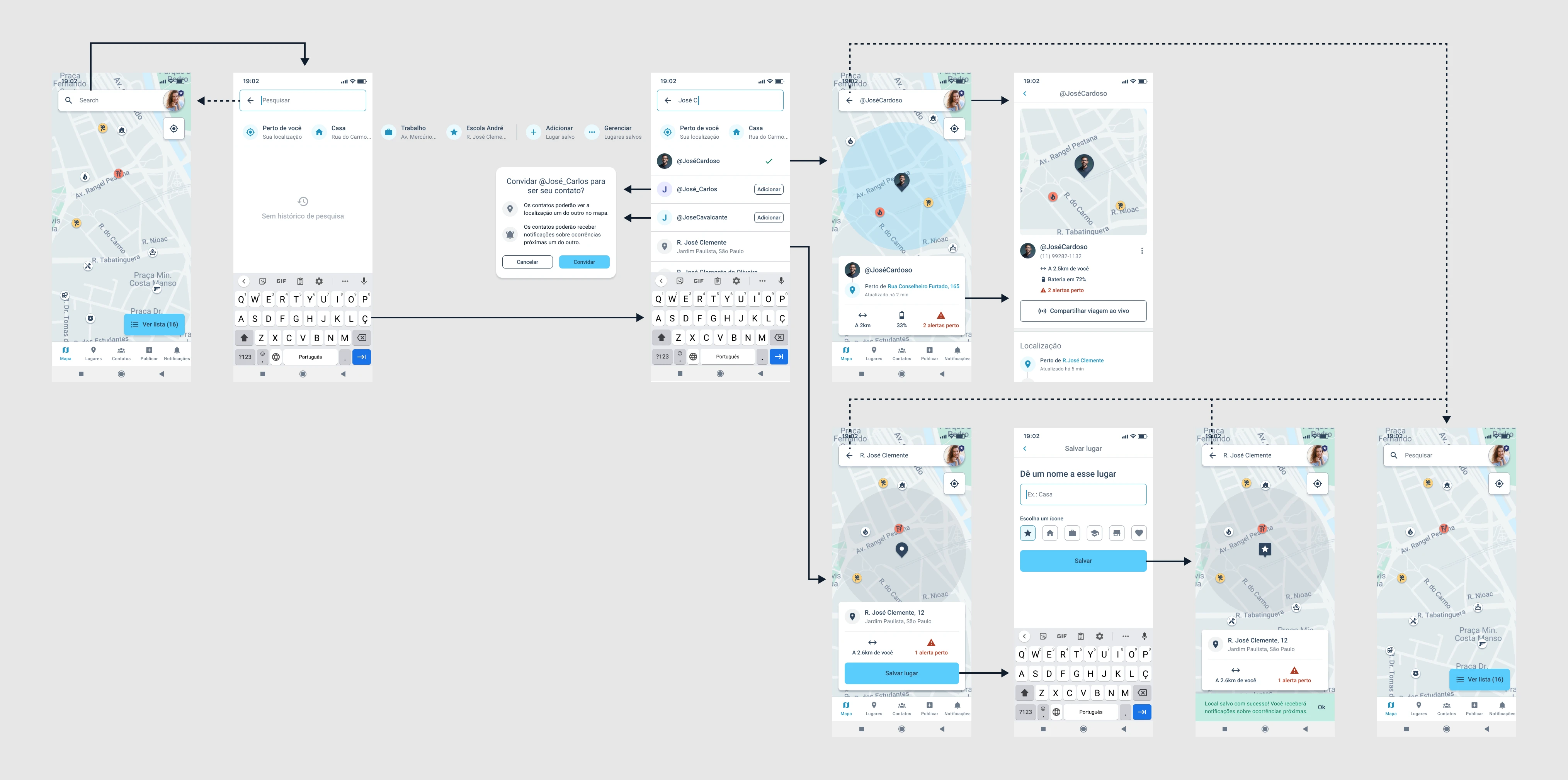
Before I get into individual features, here's an overview of Civi's core experience — the map, search, saved places, contacts, and settings that made up what most users interacted with day to day.
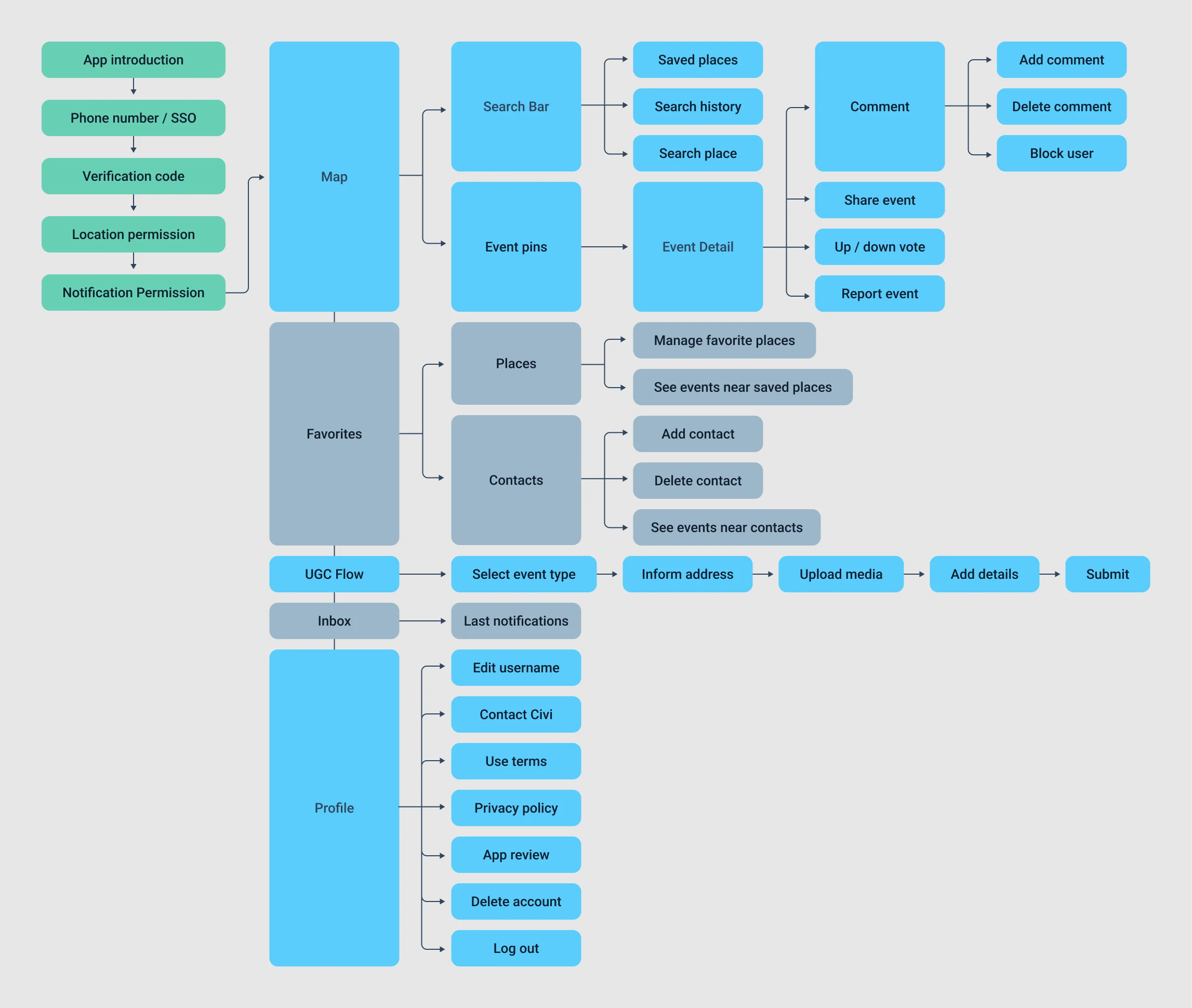
The diagram below maps the app's core flow - navigating the map, searching places, saving places, adding contacts and checking contacts.
Design system
I created Civi's design system in the second half of 2021, together with another designer. The master components gave the app a consistent visual identity, sped up development, and made it easier to scale.
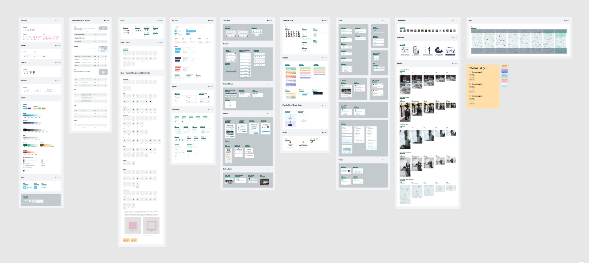
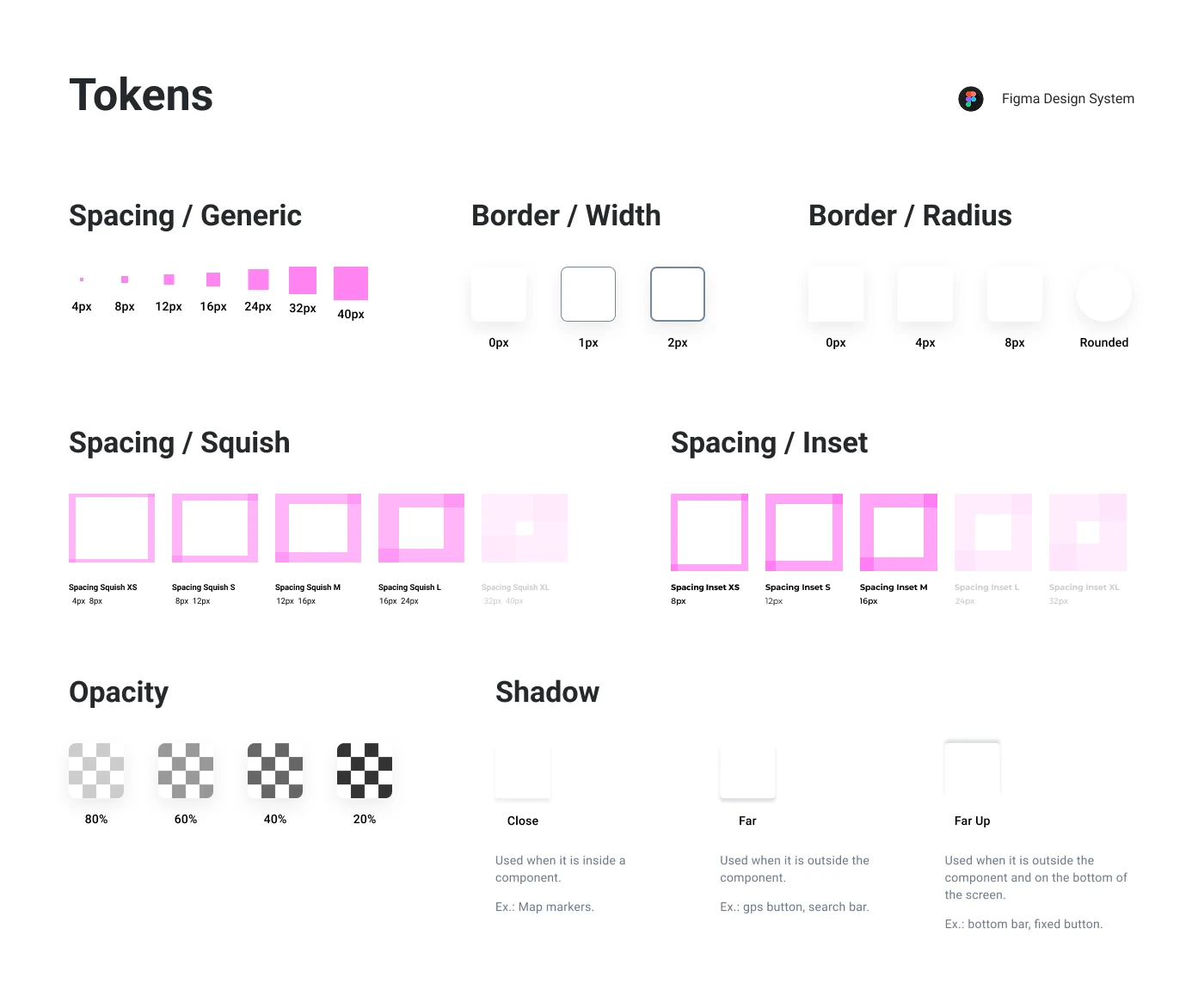
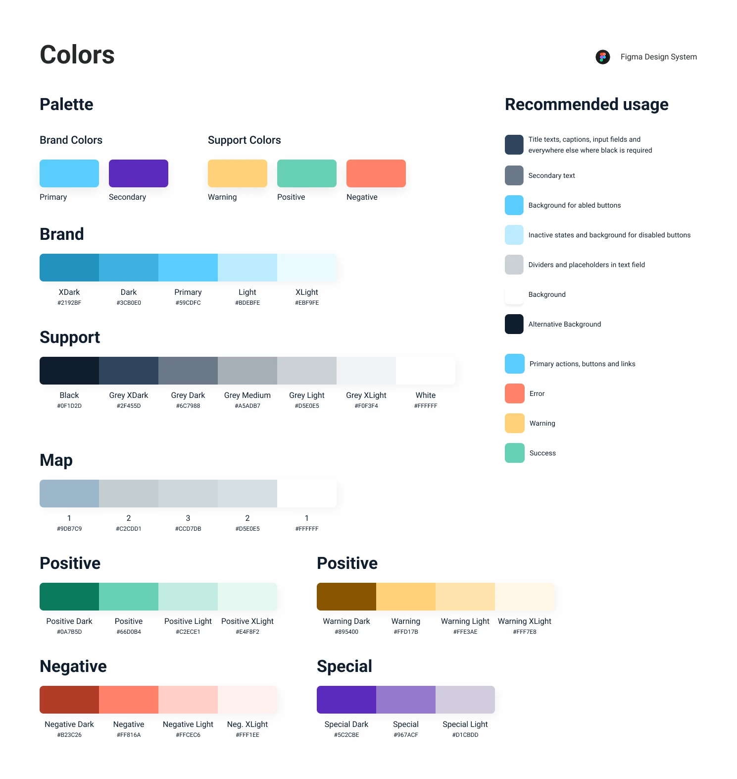
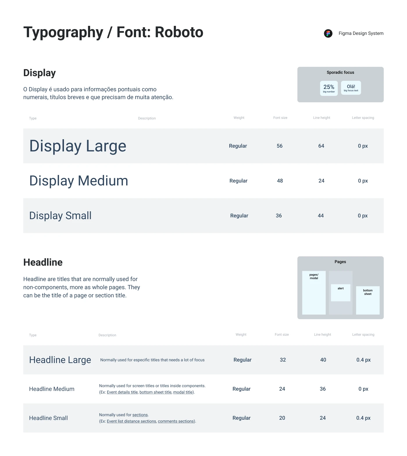
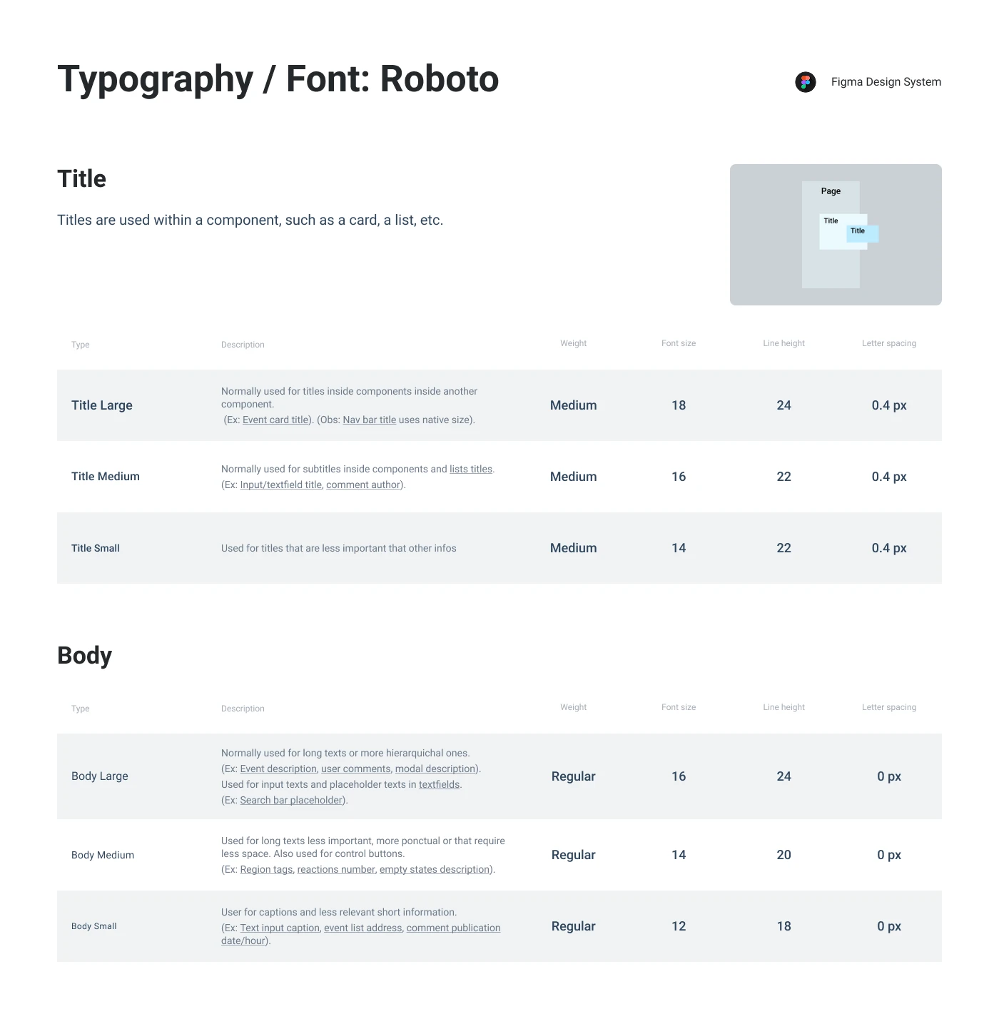
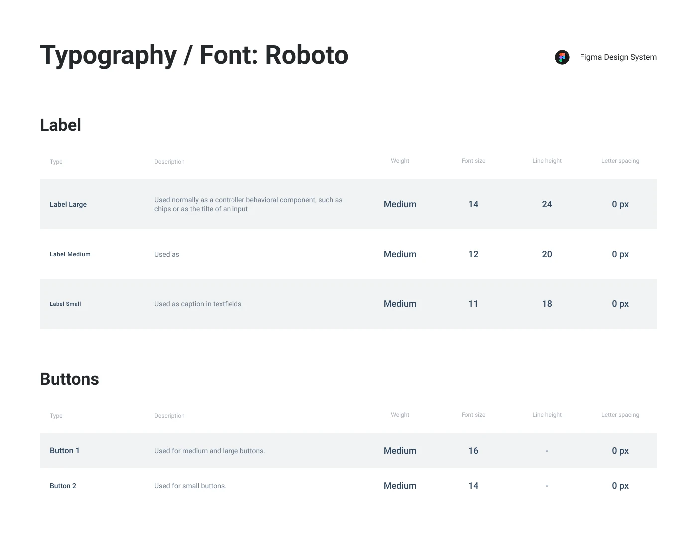
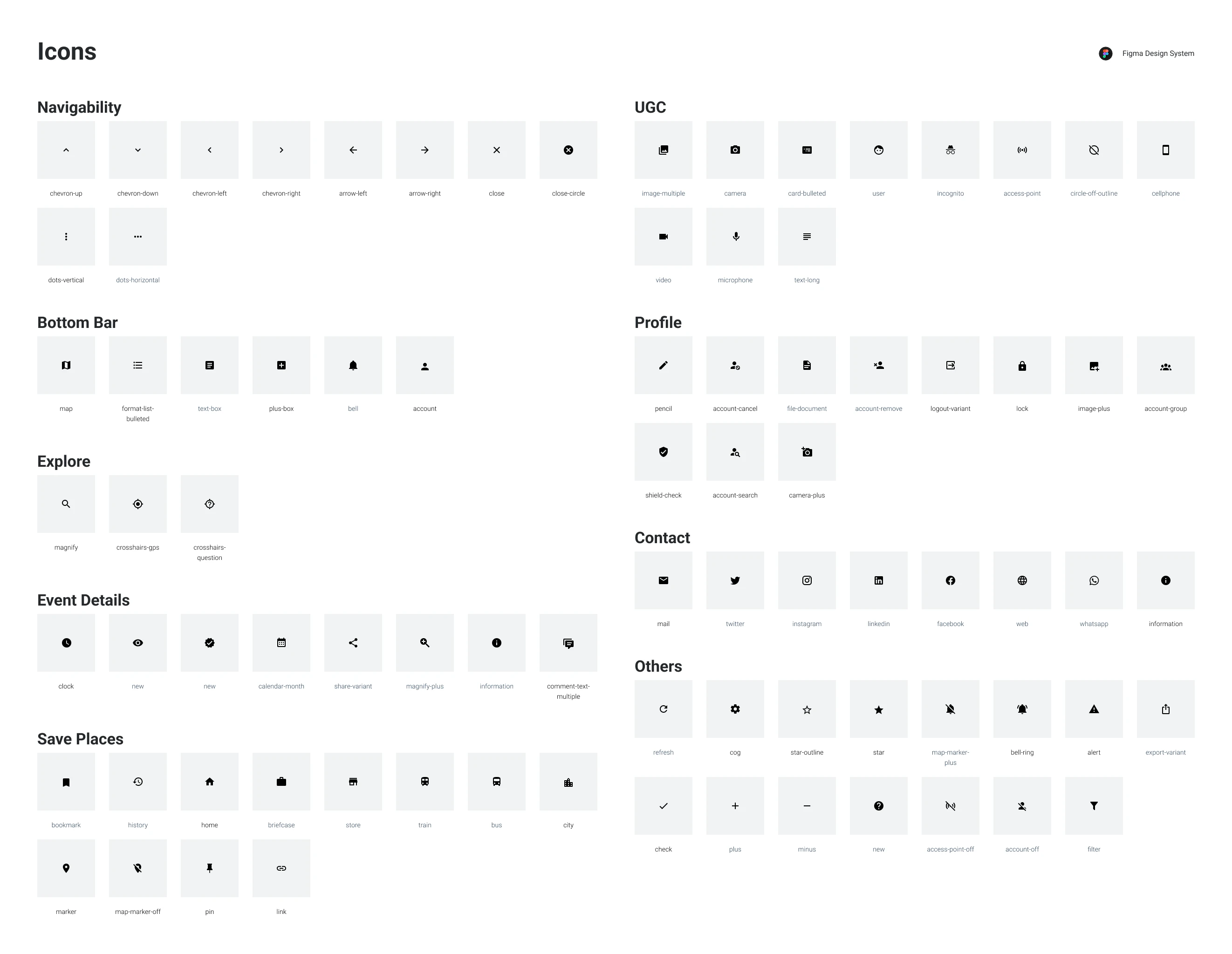
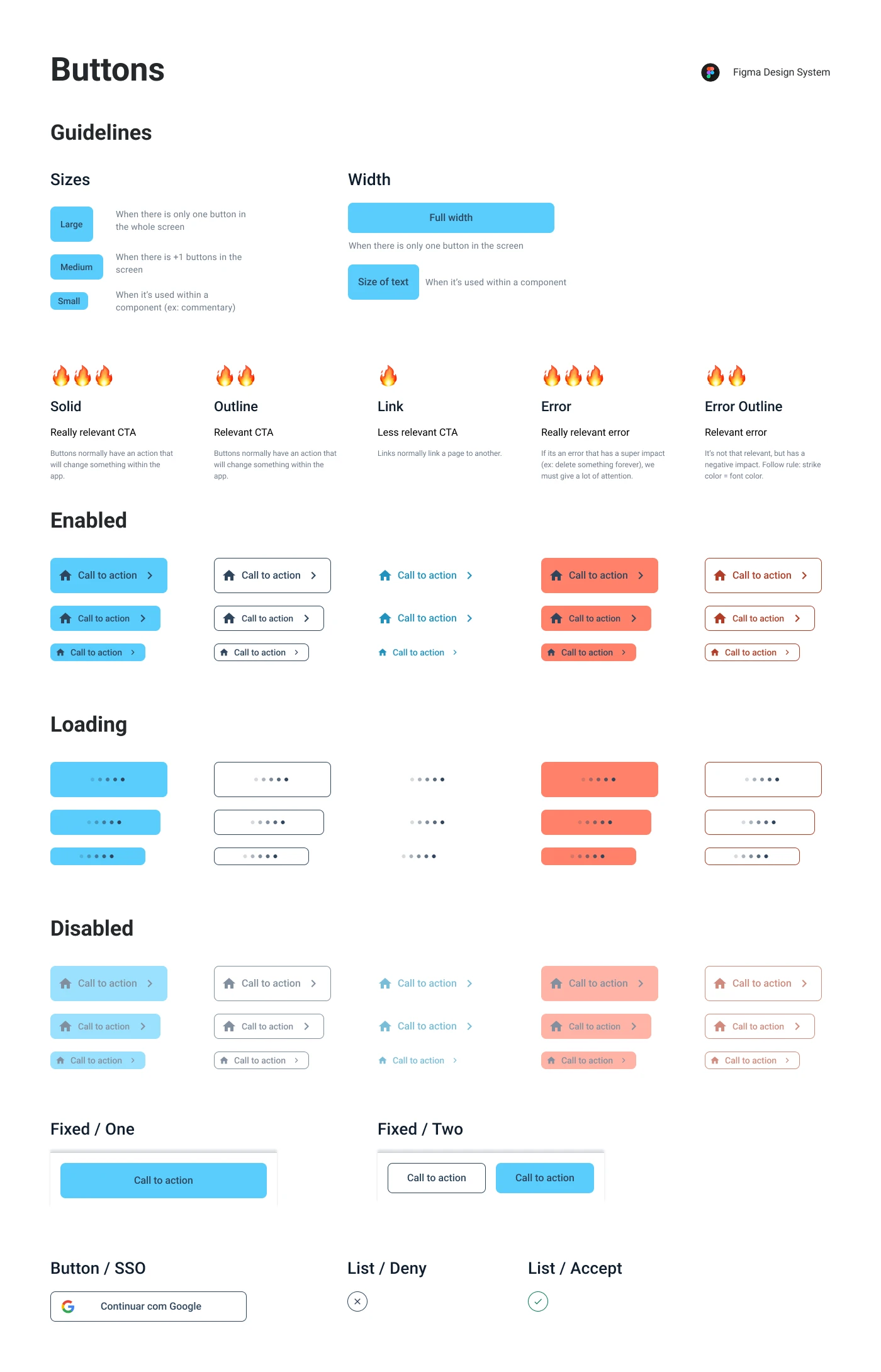
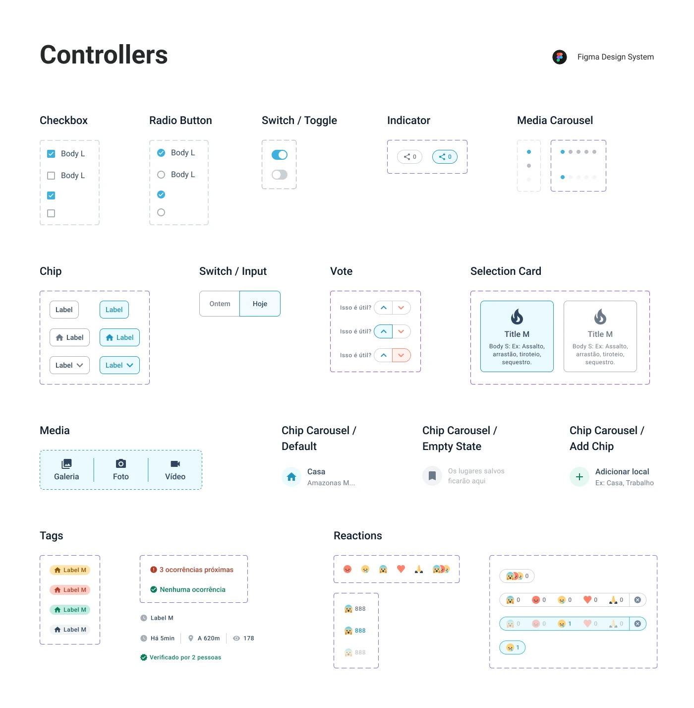
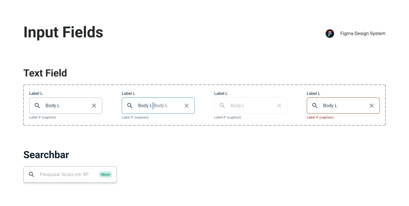
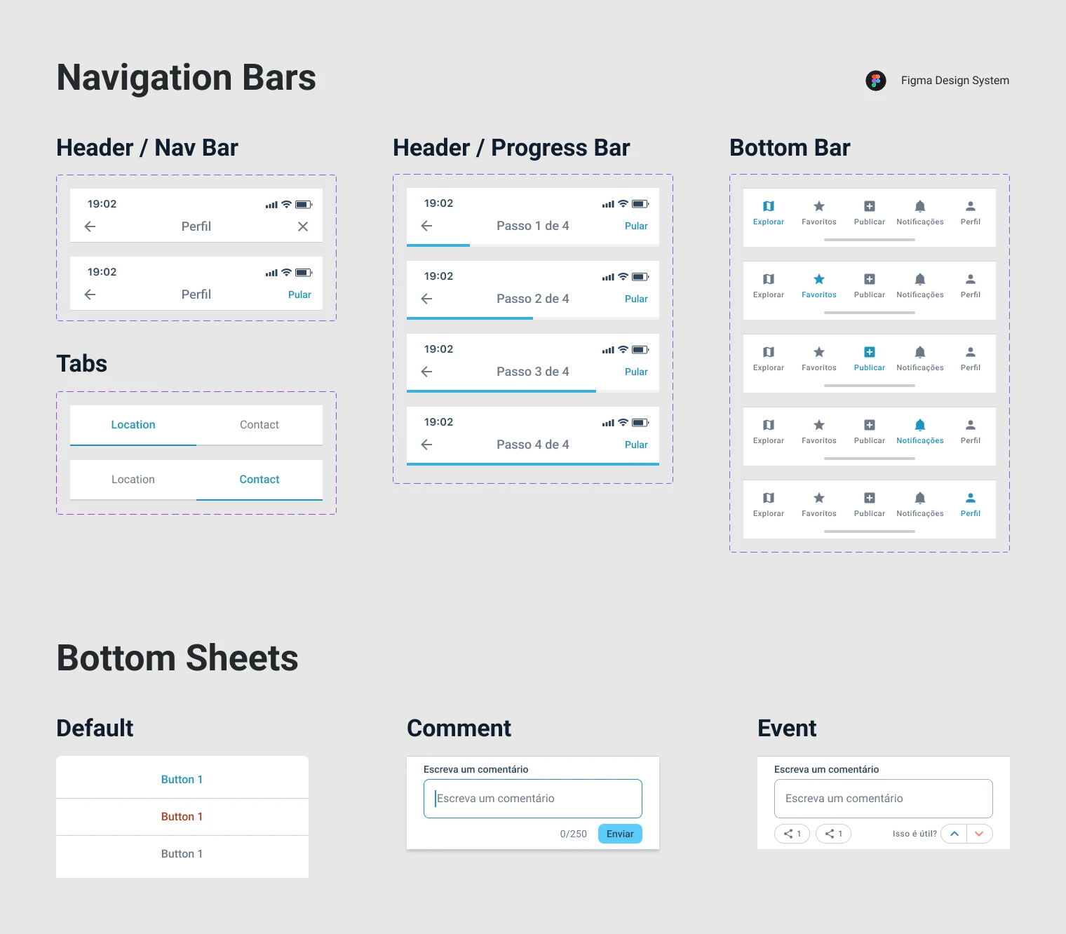
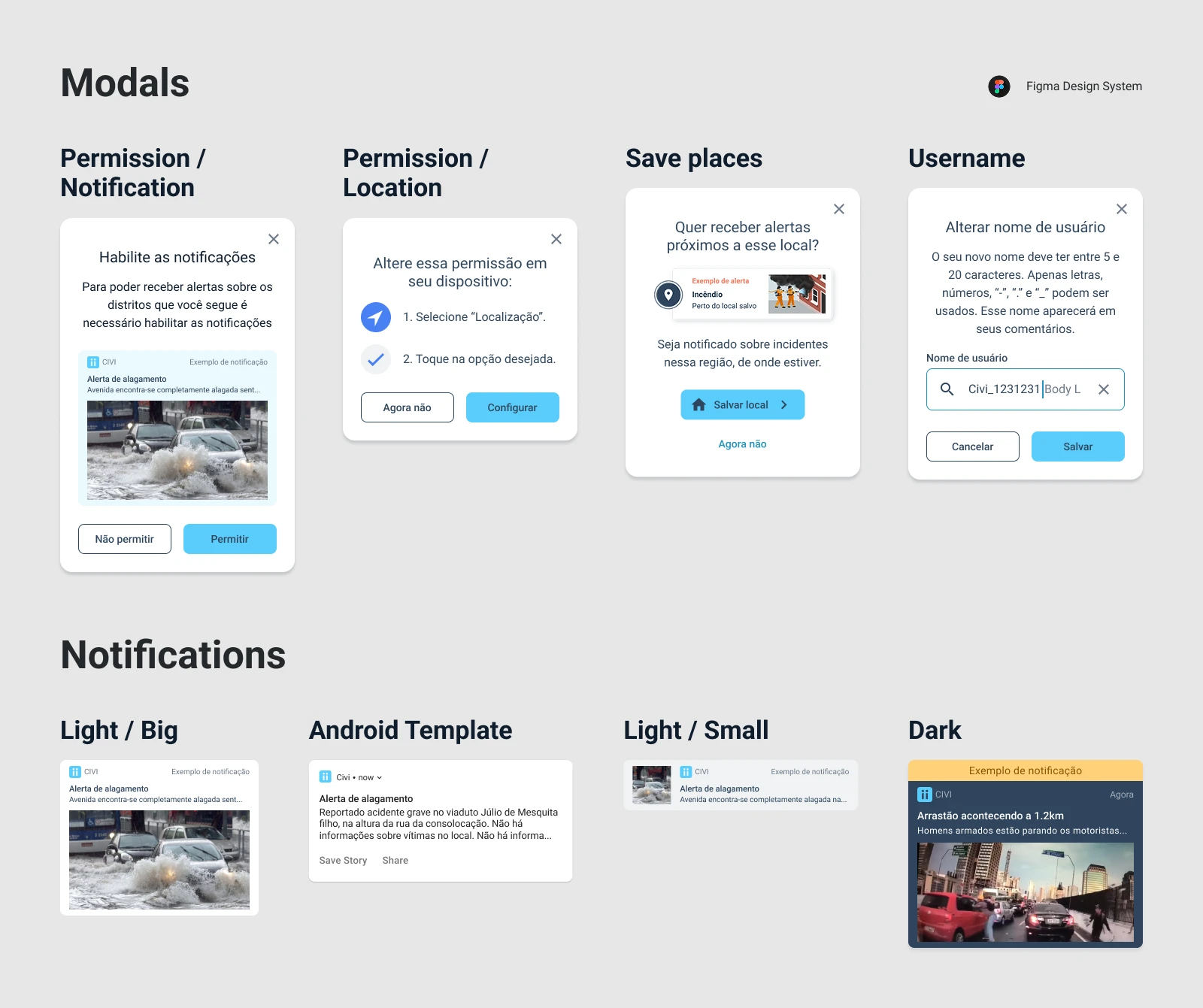
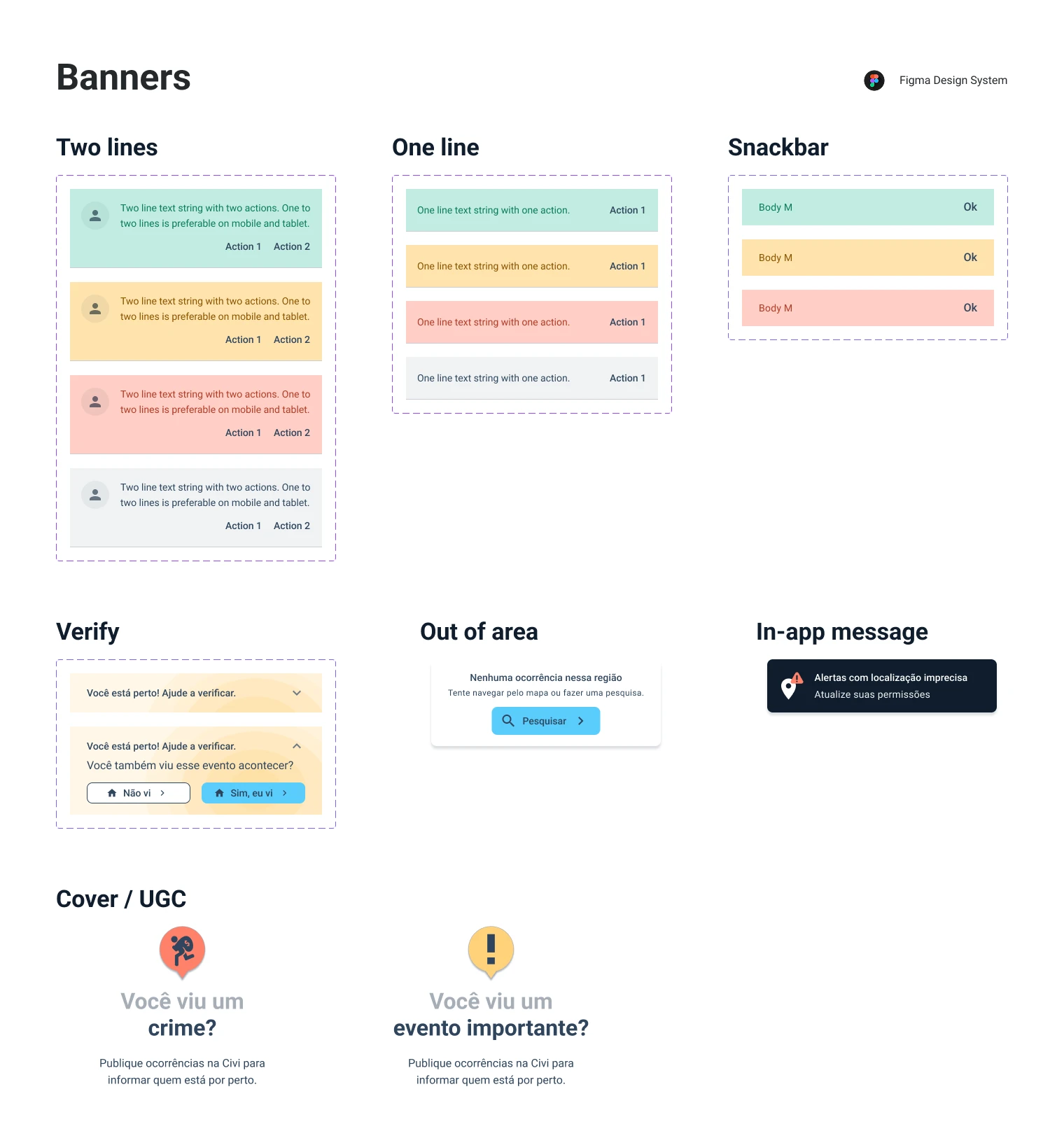
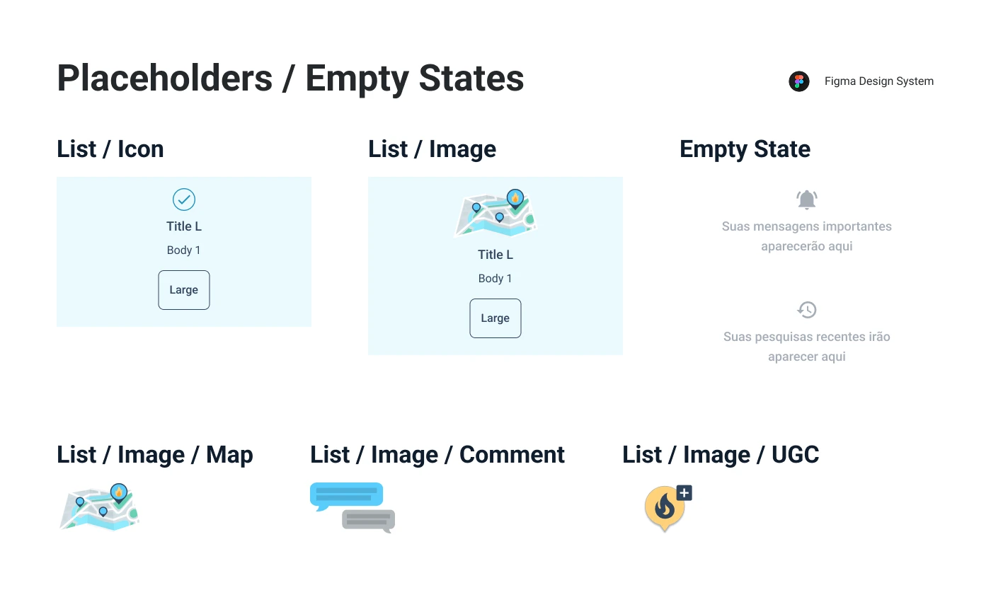
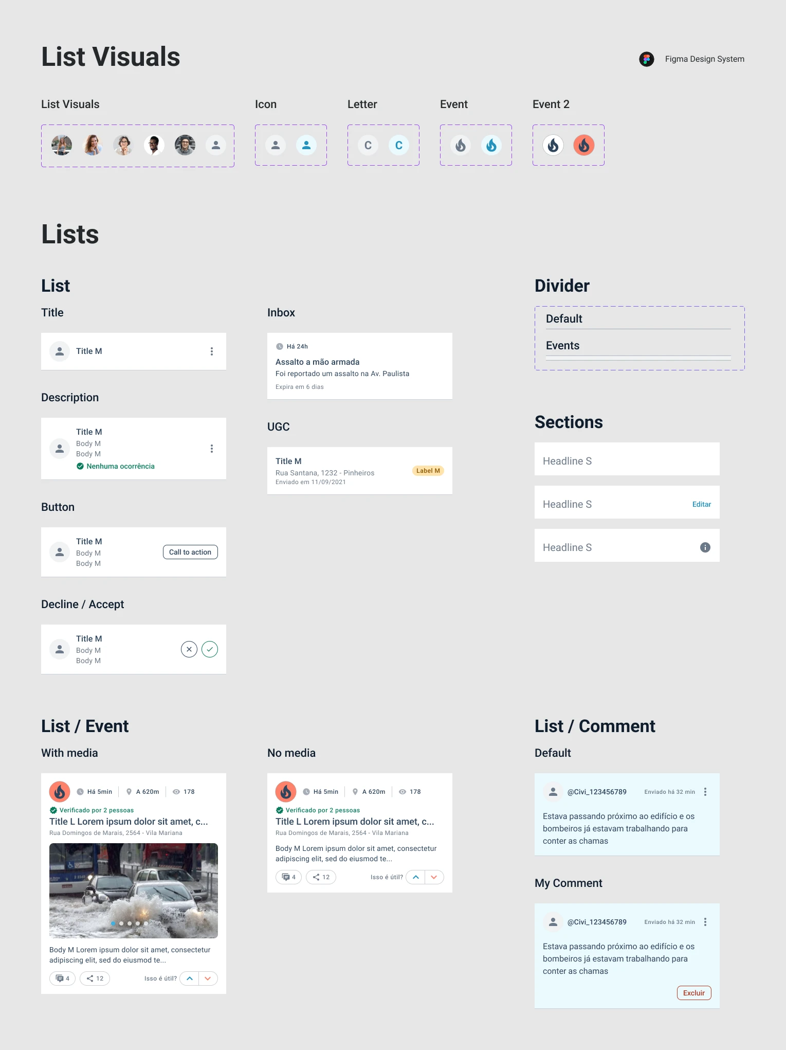
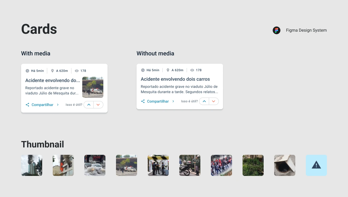
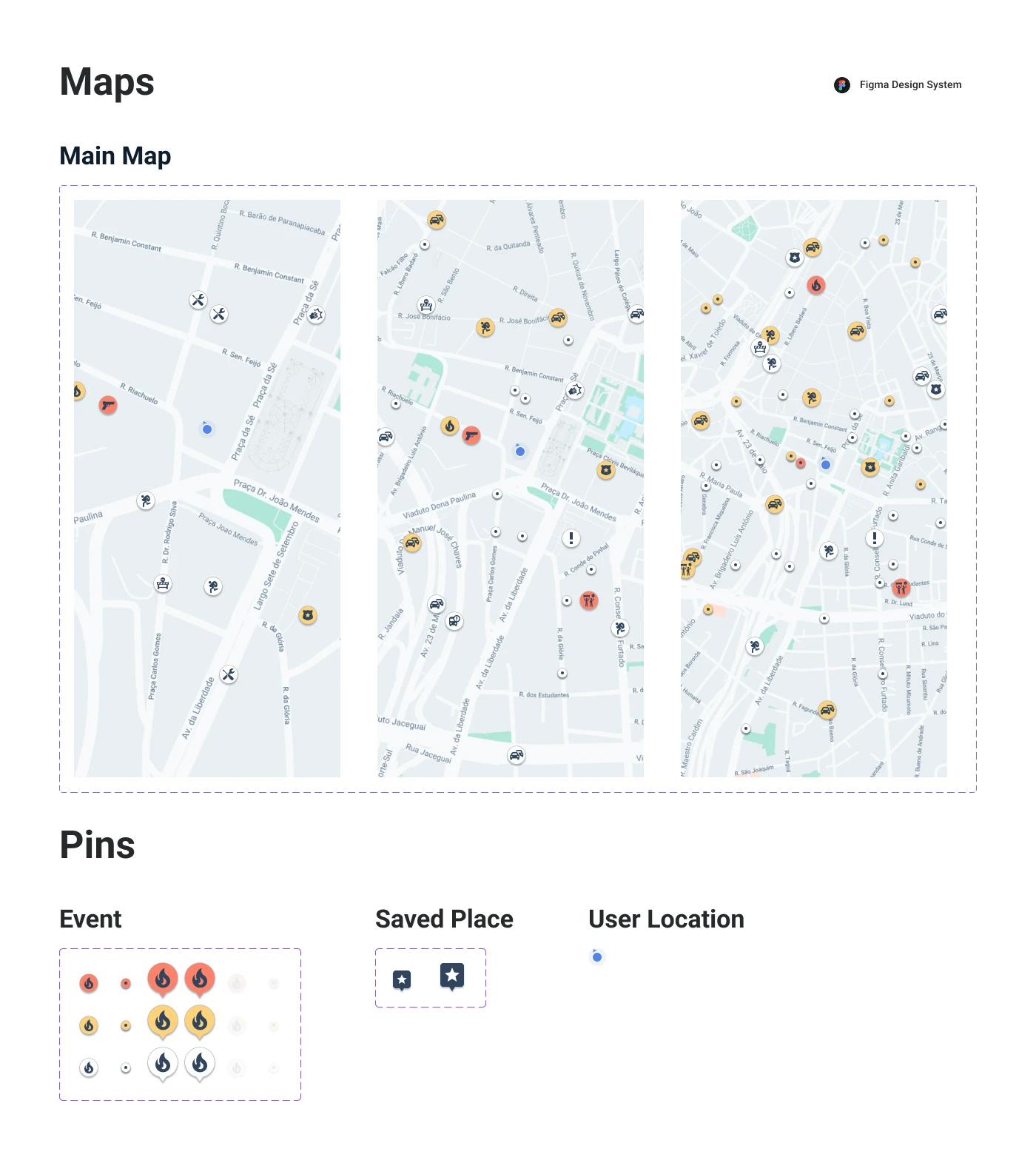
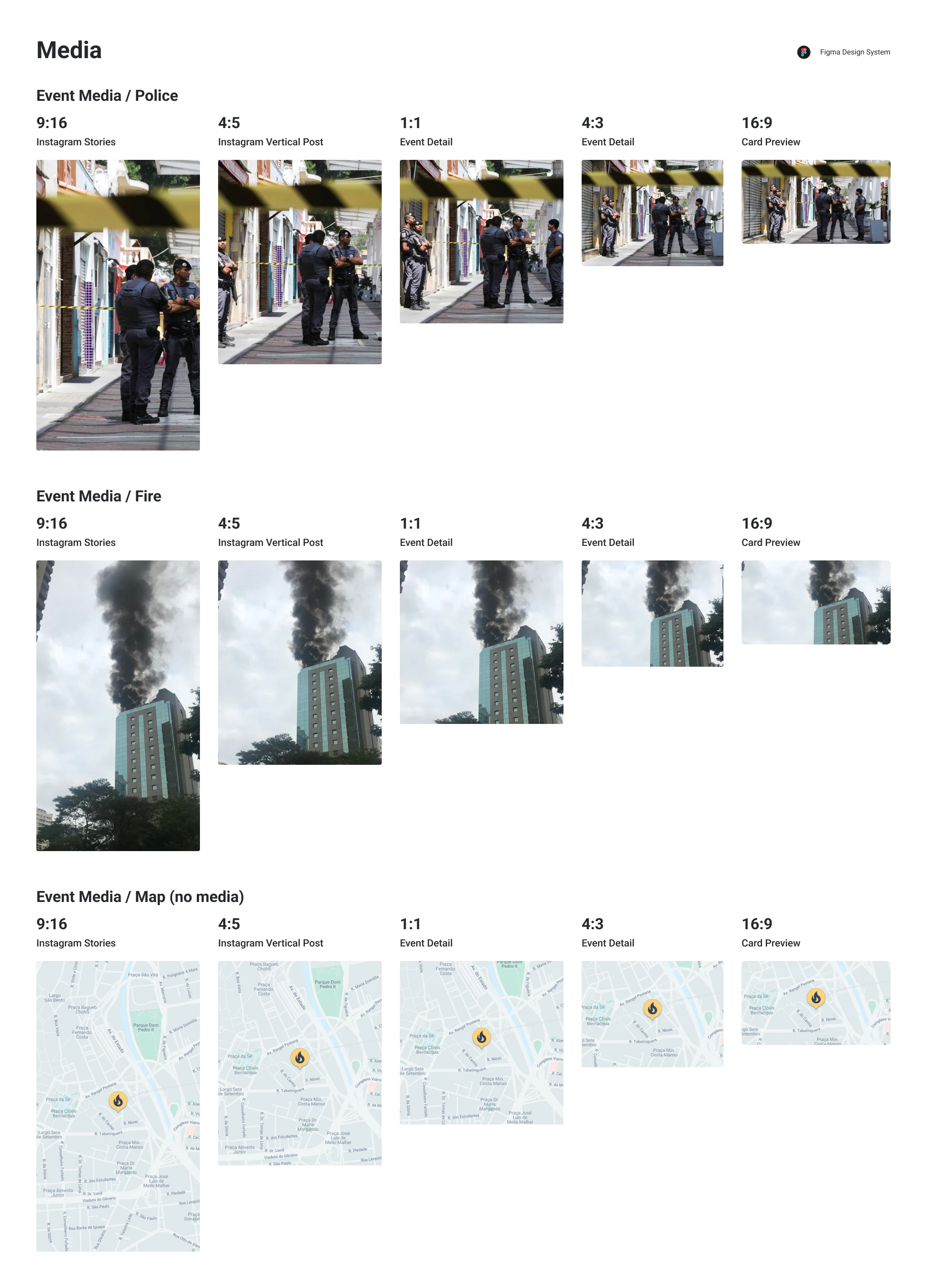
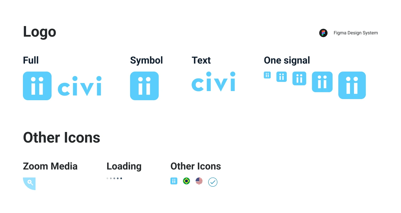
Check the full design system below, or open it in a new tab →
Case studies
A closer look at a few of these projects, end-to-end — from research and data to the results they drove.
-
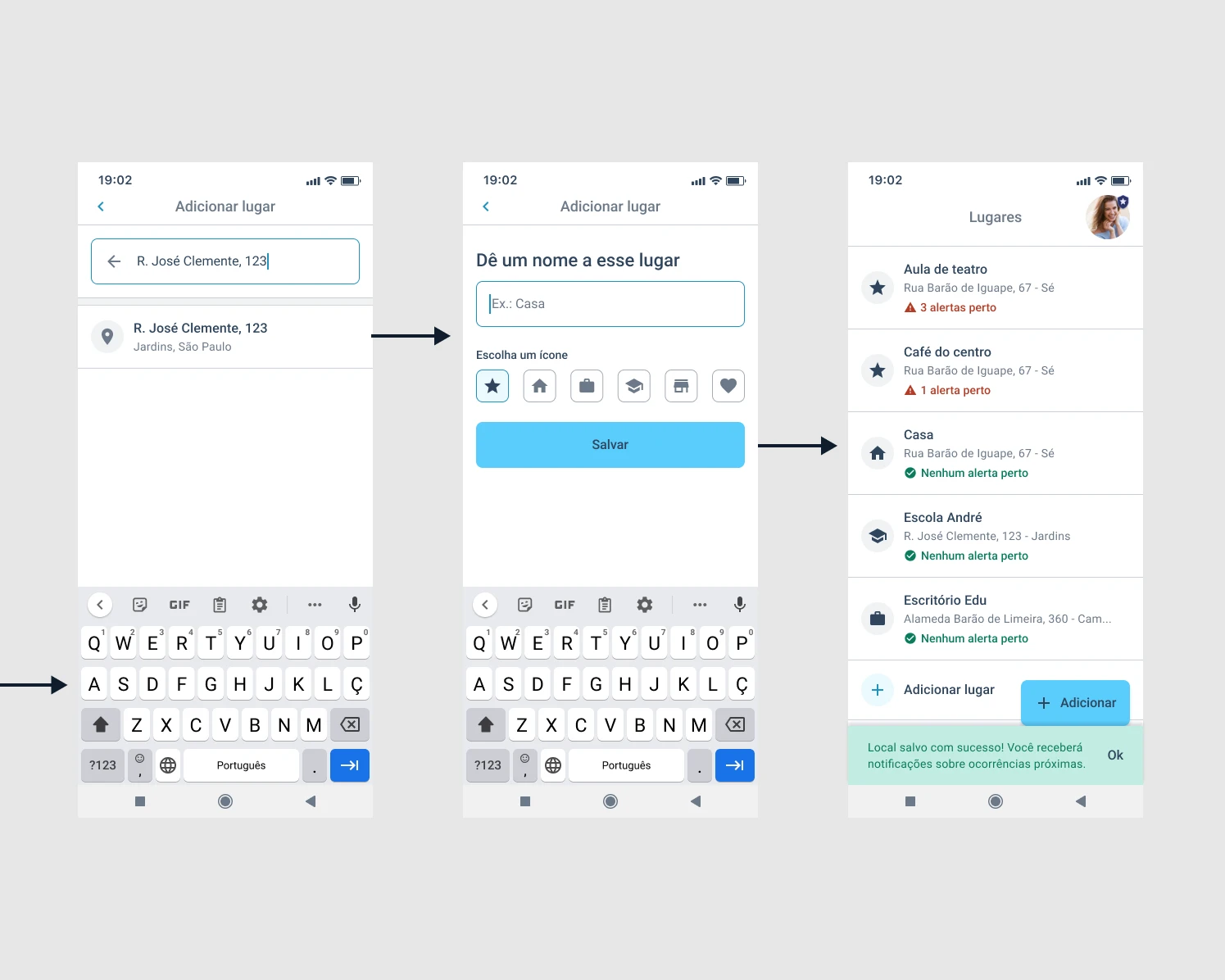
"Save Places" discovery process
User research and data analysis behind one of Civi's core features — from interviews to a feature that drove real engagement gains.
-
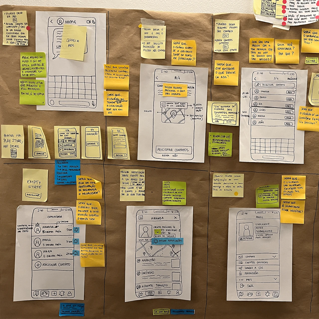
Civi Design Sprint 2.0
Facilitating a four-day sprint to design, prototype, and test a more collaborative Civi — we created a feature that let users invite friends as safety contacts.
-
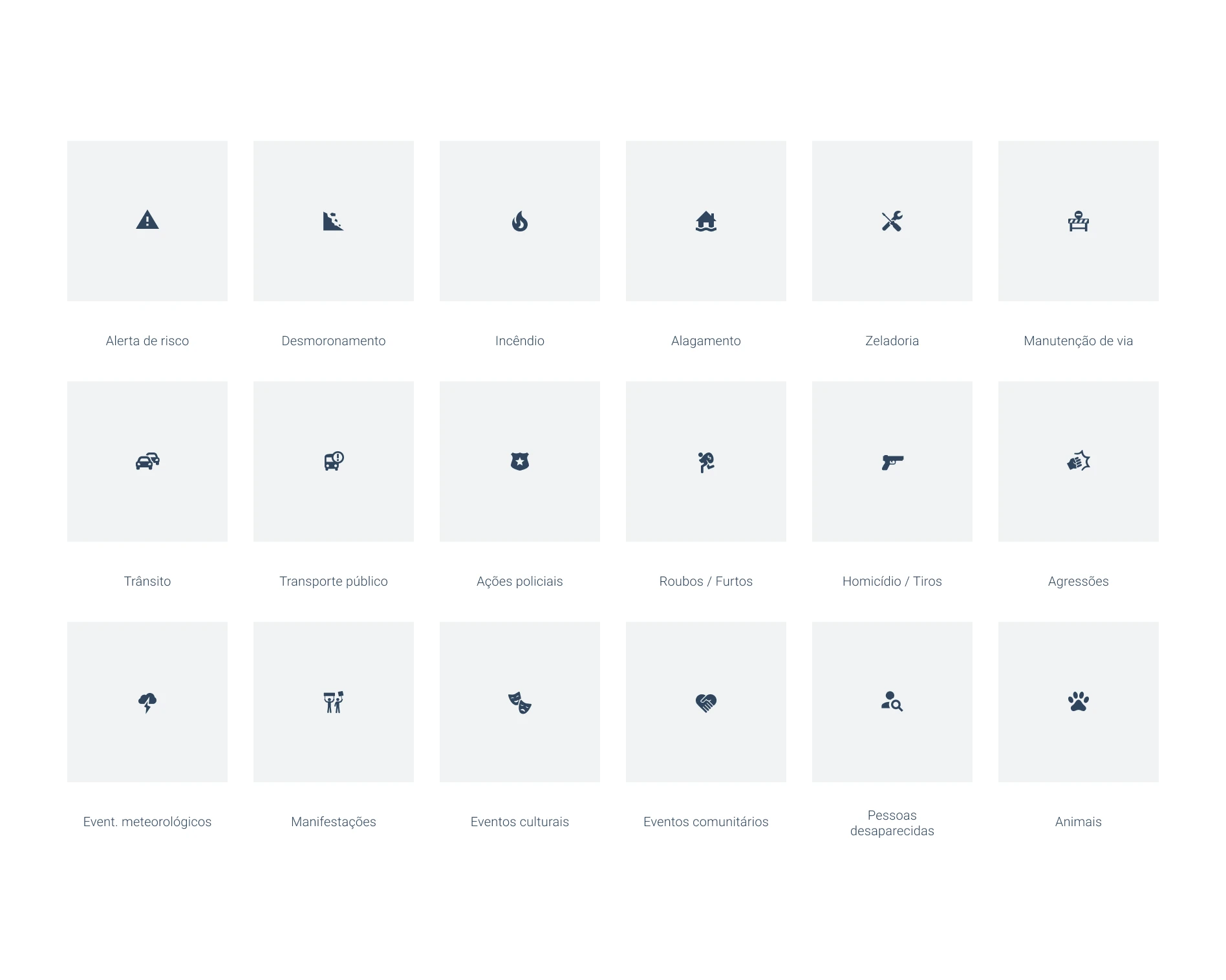
Event icons redesign
Simplifying 80+ event icons through card sorting and user testing, so the map stayed clear instead of noisy.
-
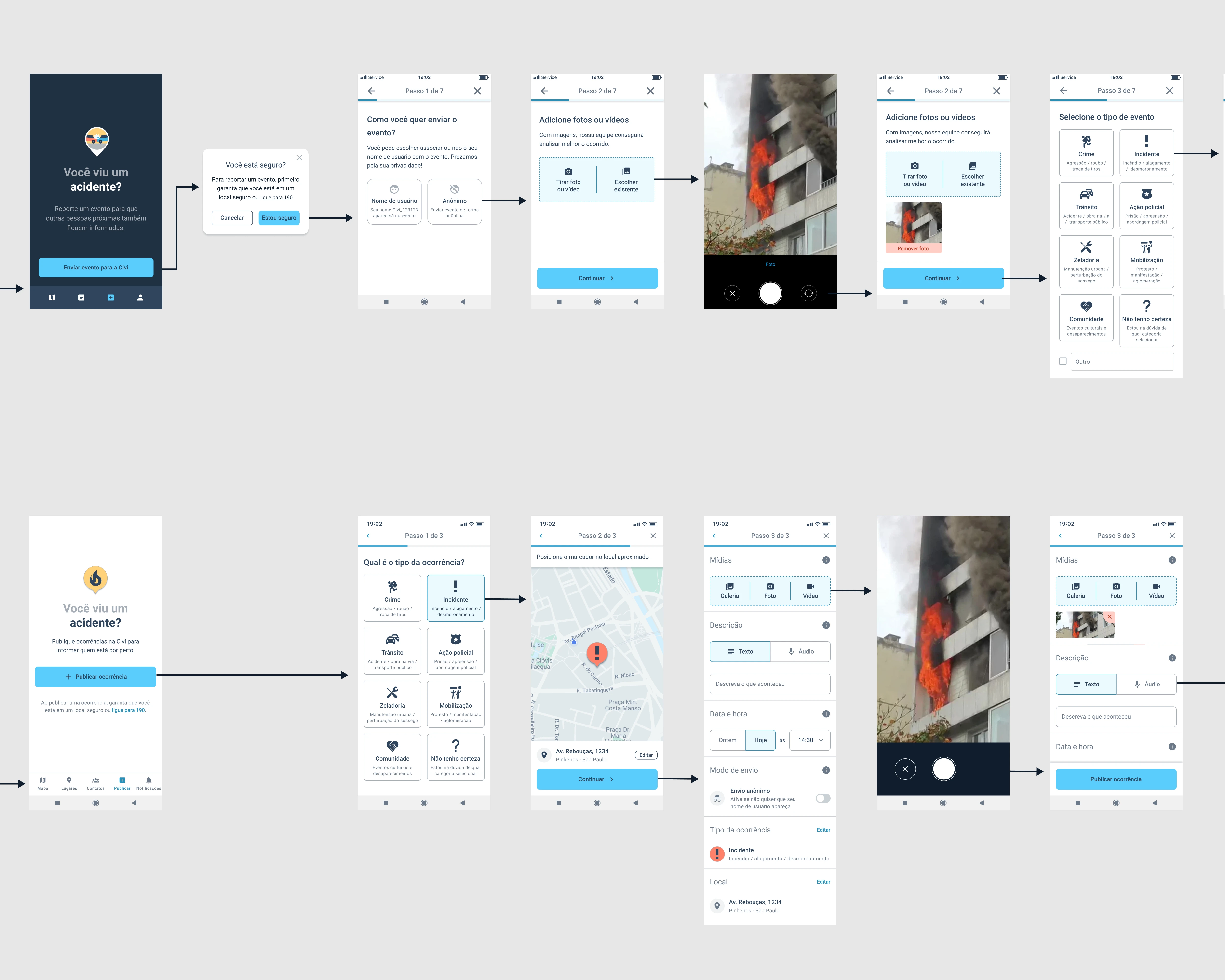
Event submission flow
Rebuilding how users report events in-app — cutting a 7-step flow down to 3 and lifting submissions 87%.
-
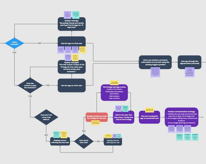
Premium plan & free trial
Designing Civi Protege, the app's paid plan, along with a two-week free trial flow.
-
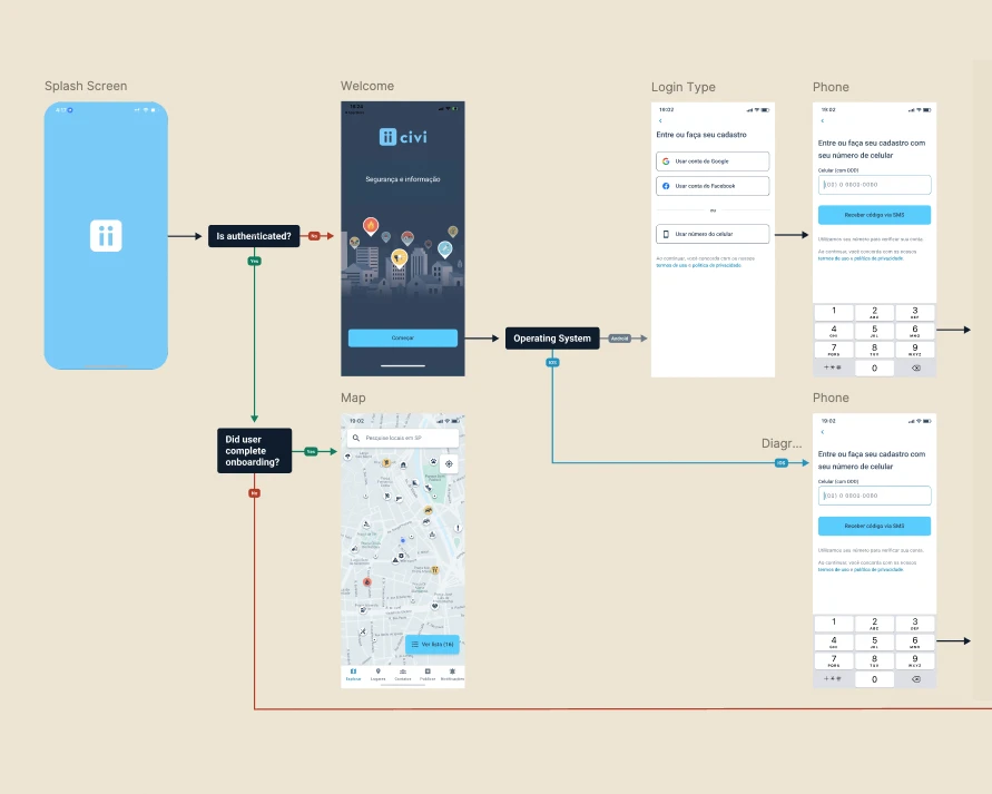
Onboarding redesign
Redesigning a high-drop-off onboarding flow to balance the information Civi needed with a fast, easy signup.
Brand and communication
Beyond product design, I was also responsible for bringing Civi's story to life across video, social media, the pitch deck, and the company website — check out that work on Civi — Brand & Communication →
The end of Civi
Around June 2023, Civi's founders shared that they hadn't been able to raise a new round of investment, and the newly launched premium plan wasn't generating enough revenue to keep the company running. Shortly after, they decided to close it down.
Looking back, a few things stand out to me:
Lack of user data from the start
It took us a long time to collect and present usage data clearly. For more than a year, I had no visibility into new users, retention, or heat maps — which made it hard to know where the real problems were.
Discovery took priority over shipping basics
I spent a lot of time on research and elaborate features before the basic experience was solid. The onboarding flow, for example, stayed buggy and visually inconsistent for too long — and that alone pushed away plenty of new users before they'd even tried the app.
Acquisition outpaced retention
We invested heavily in acquiring new users while retention was still low, so a lot of that spend went toward users who left the app almost as fast as they joined.
Monetization came too late
We wanted to build a large, popular app before introducing a paid plan. By the time Civi Protege launched, it was too late to change the company's trajectory.
This experience taught me to weigh business fundamentals — monetization, retention, team pacing — as closely as I weigh usability and visual consistency. It's a lesson I carry into every project since.