Problem & goals
Initially, each of the app's 80+ event types had its own detailed icon. In testing, I found that most users couldn't tell them apart — they were too small on the map to read at a glance.
Color was a problem too: the app used blue, gray, yellow, and red backgrounds to show how recent an event was, but since the icons were colorful as well, it was hard to tell what the background color meant. Instead of helping, the icons made the map visually noisy and confusing.
Goals
- Simplify the event icons, making them more intuitive and accessible.
- Make the pins on the map clear and easy to understand.
- Create event type categories to allow the implementation of simple map filters by event type.
Process
Card sorting
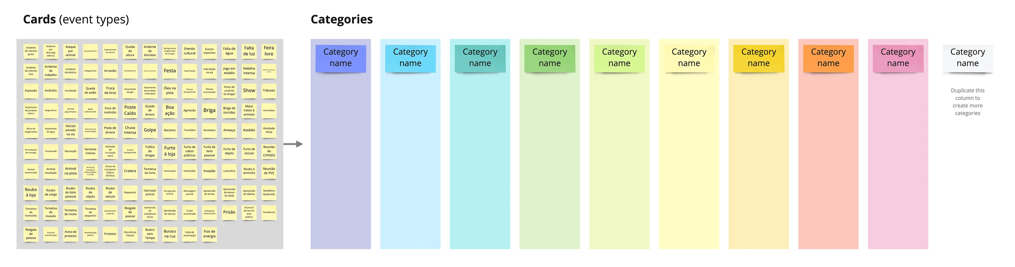
I used card sorting to organize the event types into categories that would feel intuitive to users.
Participants sort a set of cards into groups based on how they relate — it's a simple way to learn how people naturally categorize information, so the product's structure matches how they actually think.
Dynamic instructions
The participants were asked to do the following:
- Read the post-its one by one.
- Organize them into groups that make sense to you, by dragging the cards to the columns on the side. There's no right or wrong — follow your intuition.
- You can move cards between categories if you change your mind during the process.
- Use as many categories as you like — you don't need to fill every column. Duplicate the last one if needed. Colors are for visual clarity only.
- Name each category as it makes sense to you.
Gathering and analysing results
I collected all the results into one big matrix, then looked for patterns across categories.
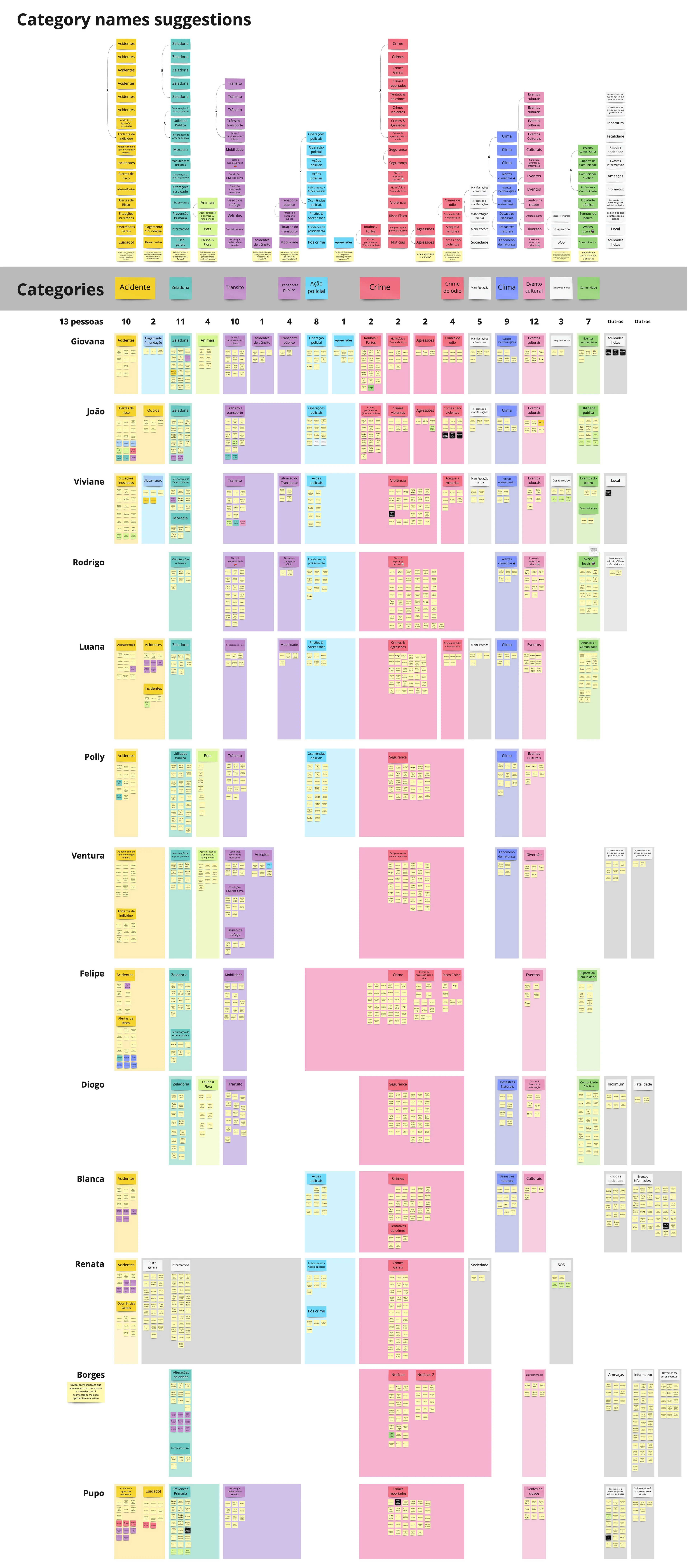
Results
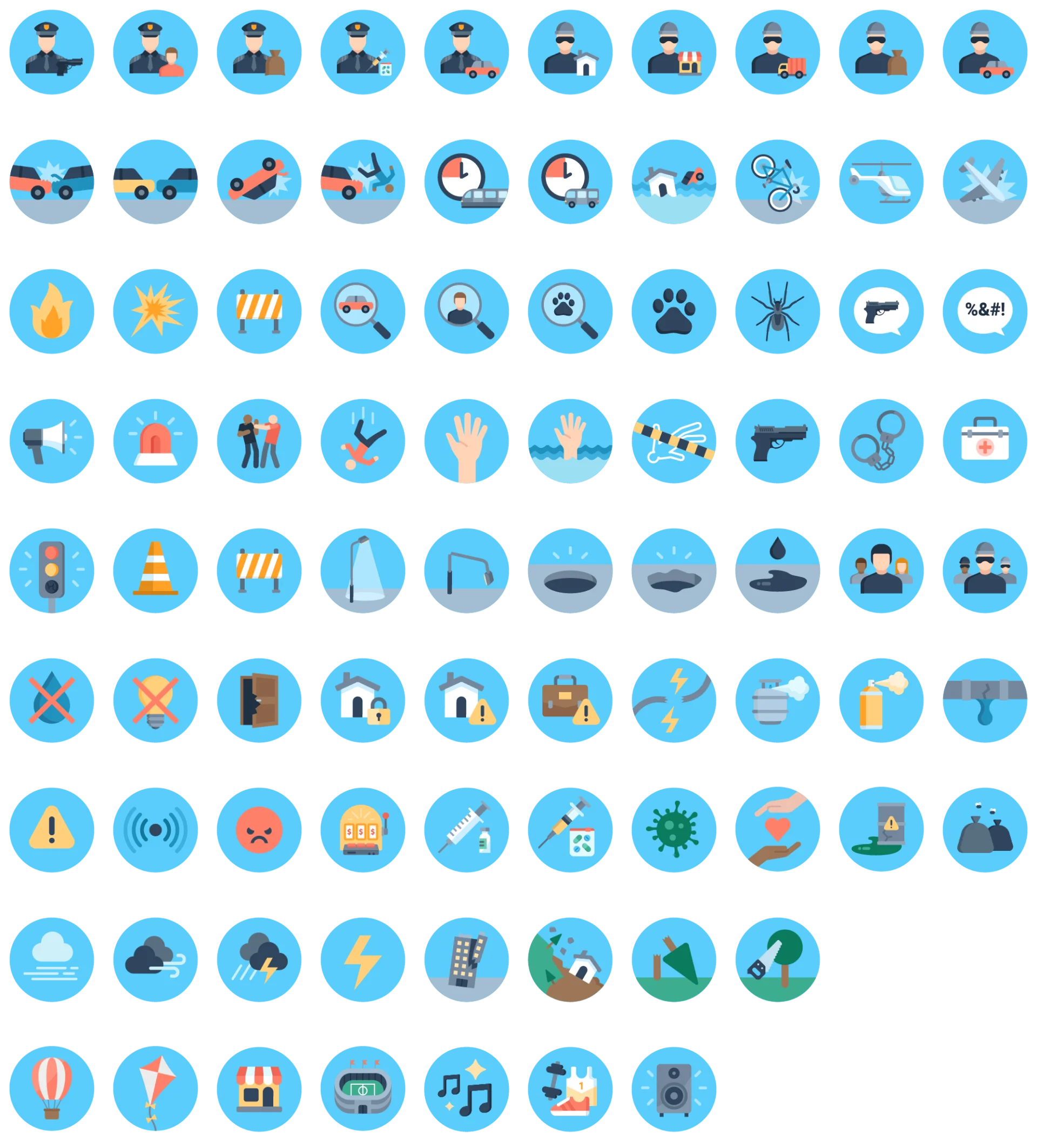
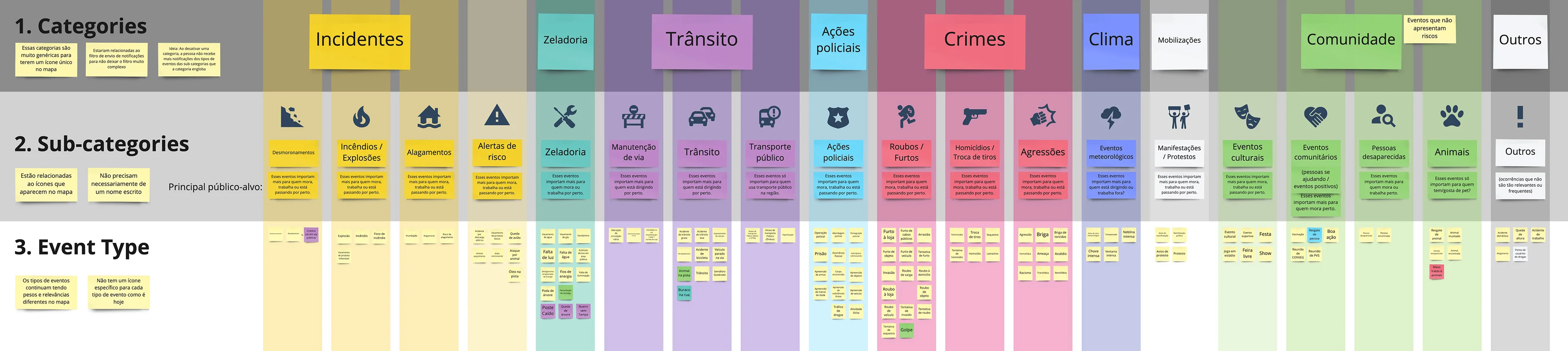
The analysis led me to 19 event categories, and I designed a monochromatic icon for each one.
Testing new icons with users
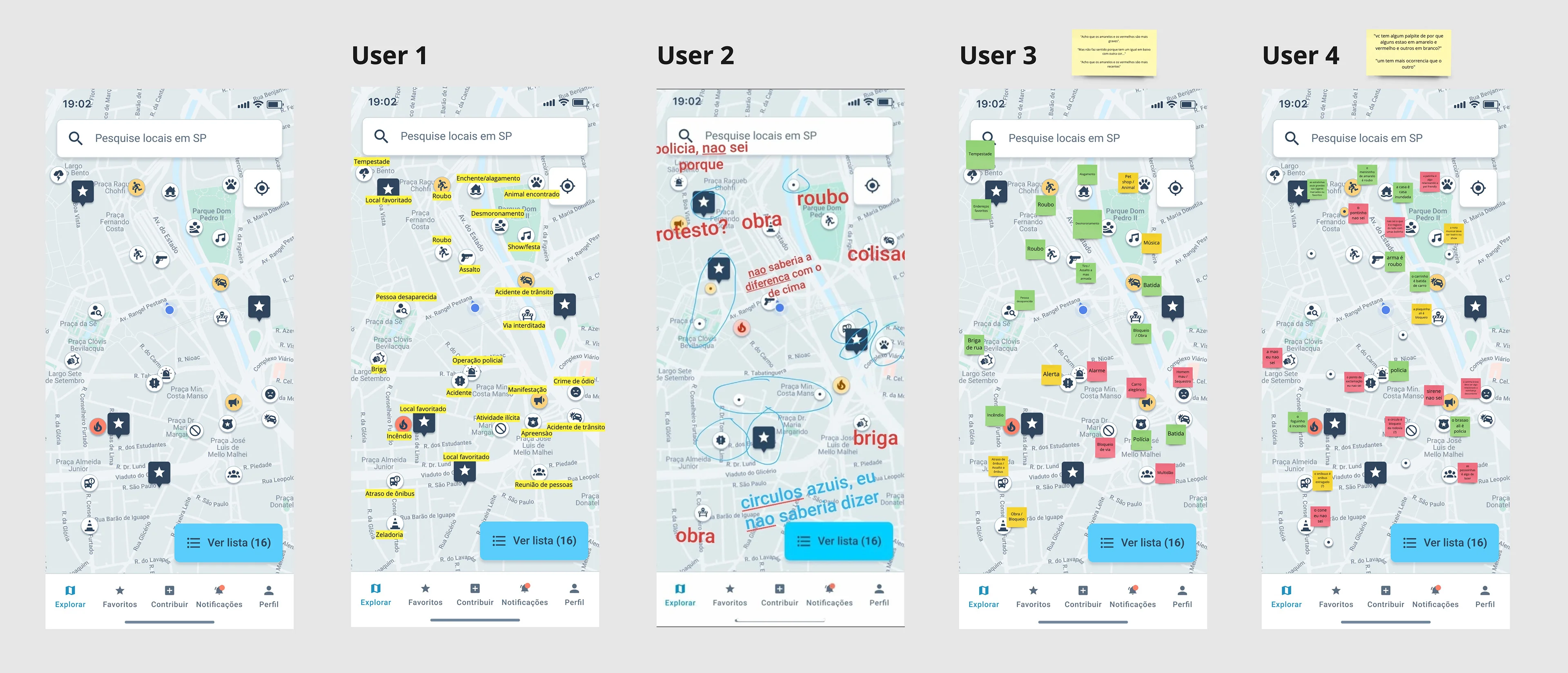
I applied the new icons to a map simulation, then asked a few people what they thought each one meant, without giving them any context.
Icons final design
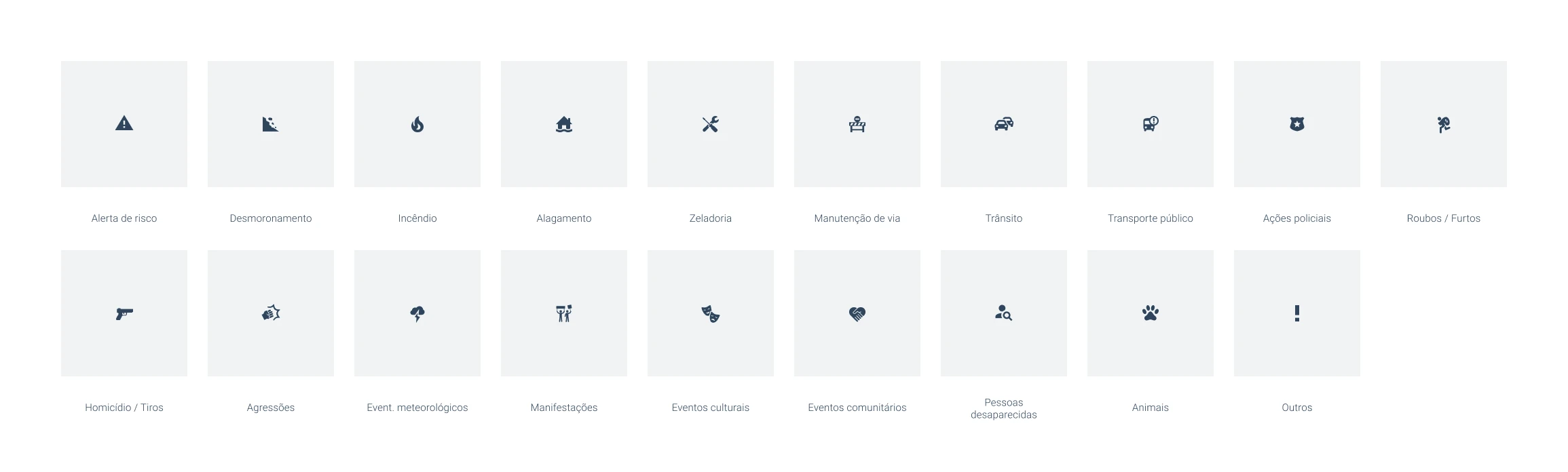
This is the result of the new event categories and their icons.
Event density
Problem
As all the pins on the map had these new icons, the map was still looking very dense in information. It was difficult to decide which pin to click first.
Besides that, back in the Save Places interviews, many users had asked for an event type filter to see only the event types relevant to them on the map.
We didn't have a very big quantity of event submitions everywhere in the city. Filtering by event type would likely leave the map looking empty in areas without much activity.
Besides that many users would forget about this filter and they would never see lots of possibly relevant information.
Solution
To get around this, we designed an event relevance score instead of a simple filter.
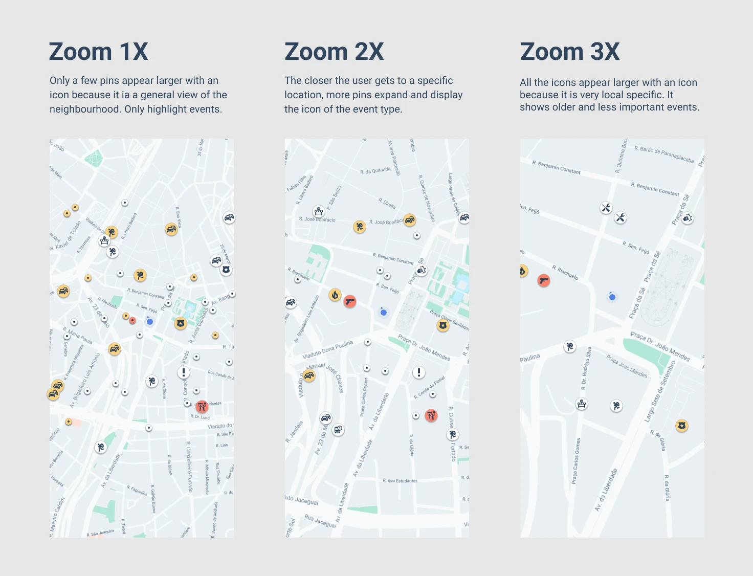
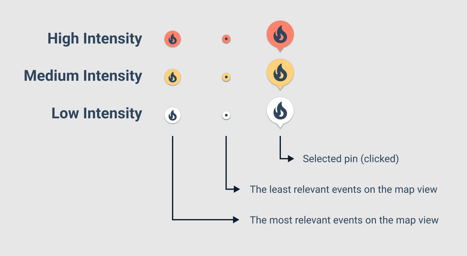
We set a maximum number of pins that would appear expanded with icon on the map, the rest appeared as a smaller dot — just enough to suggest something had happened there.
Each event got a score based on recency, gravity, and distance — gravity being a 1–10 rating we assigned to each event type by severity.
The map showed the highest-scoring events larger and more prominently. By zooming in the users could see more local, lower-priority events as the view area shrank.