
Onboarding flow
Problem
Onboarding was one of the app's most elaborate flows, with a high drop-off rate — largely because it asked for a lot of personal information upfront: home address, work address, device location, and more.
Solution
Together with another designer, we redesigned the onboarding flow to strike a better balance — collecting what we needed while keeping it short and easy to get through.

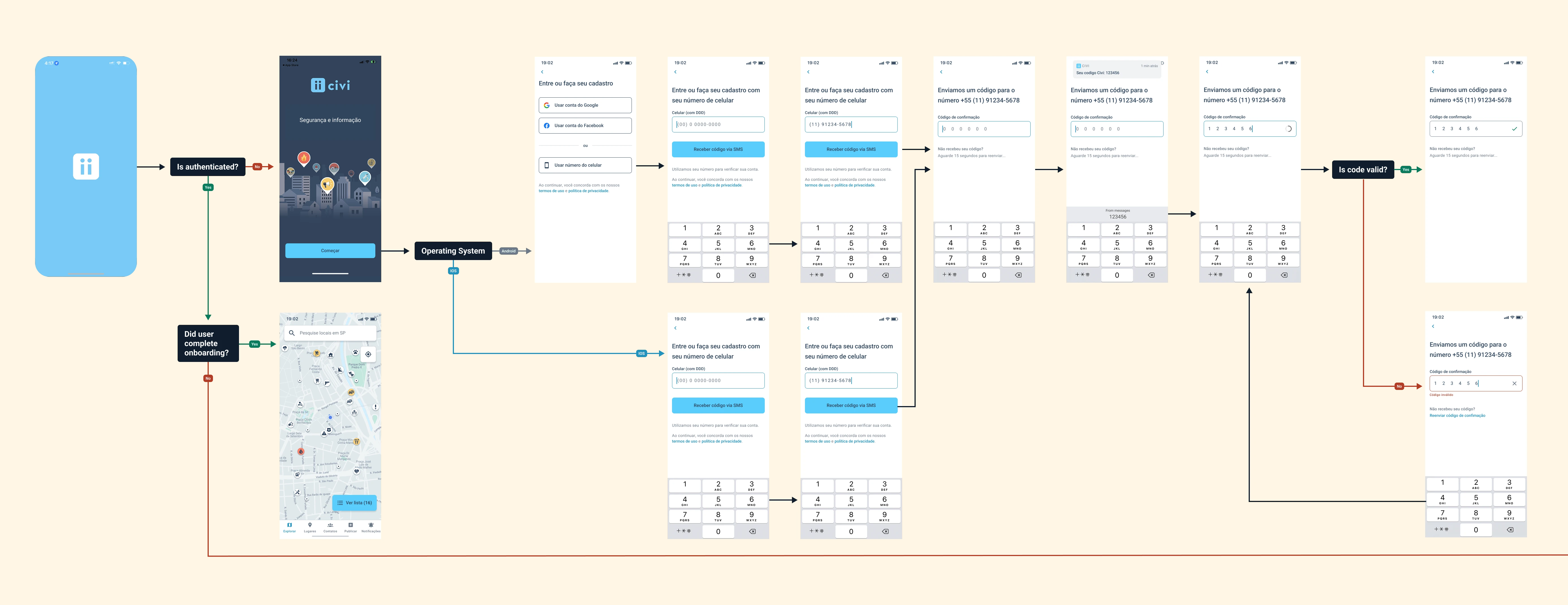
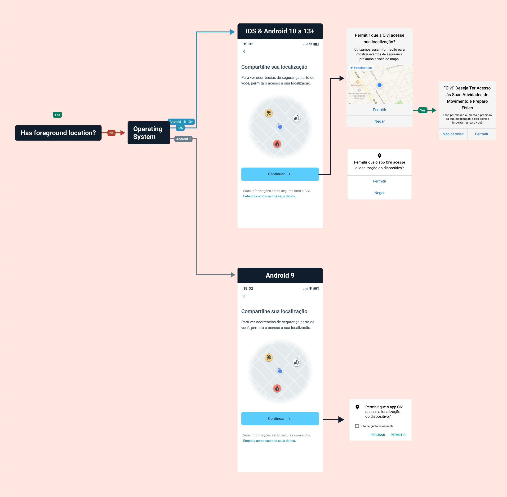
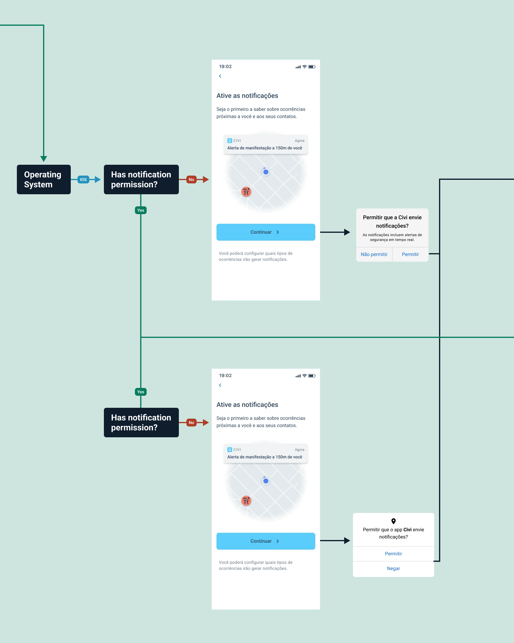
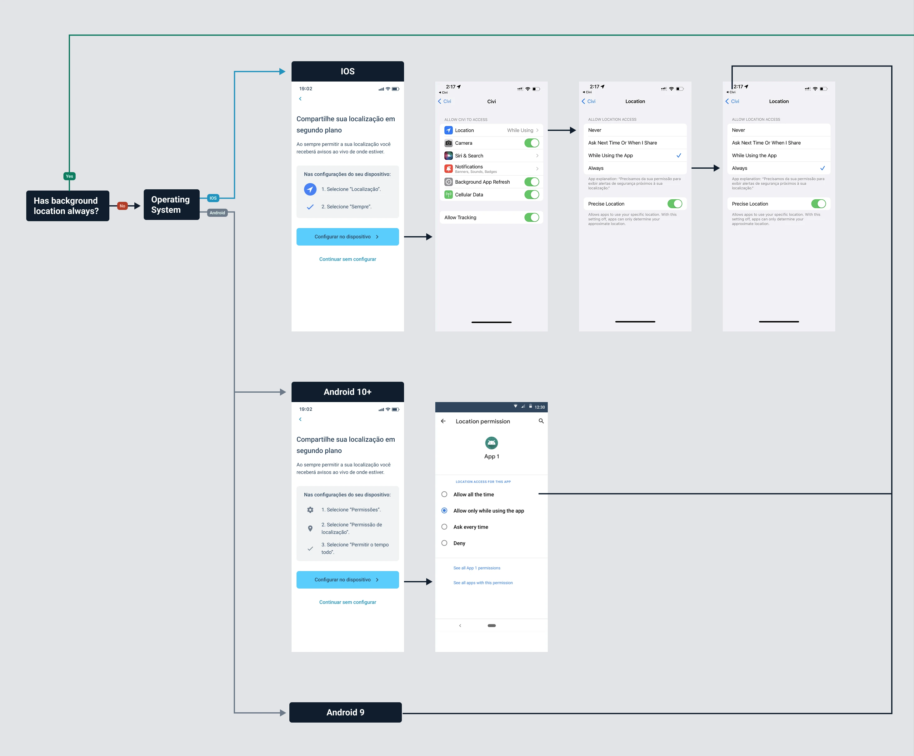
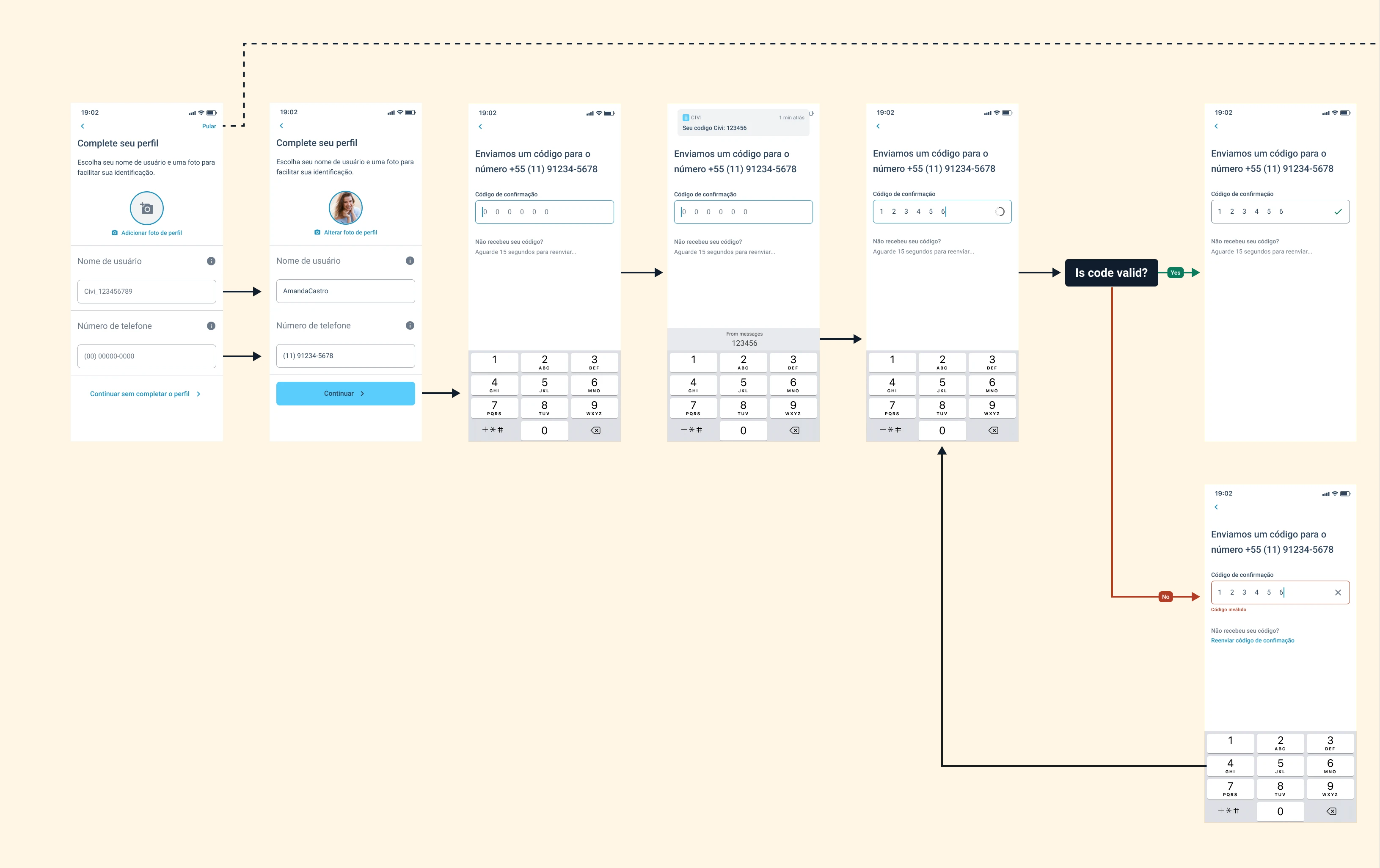
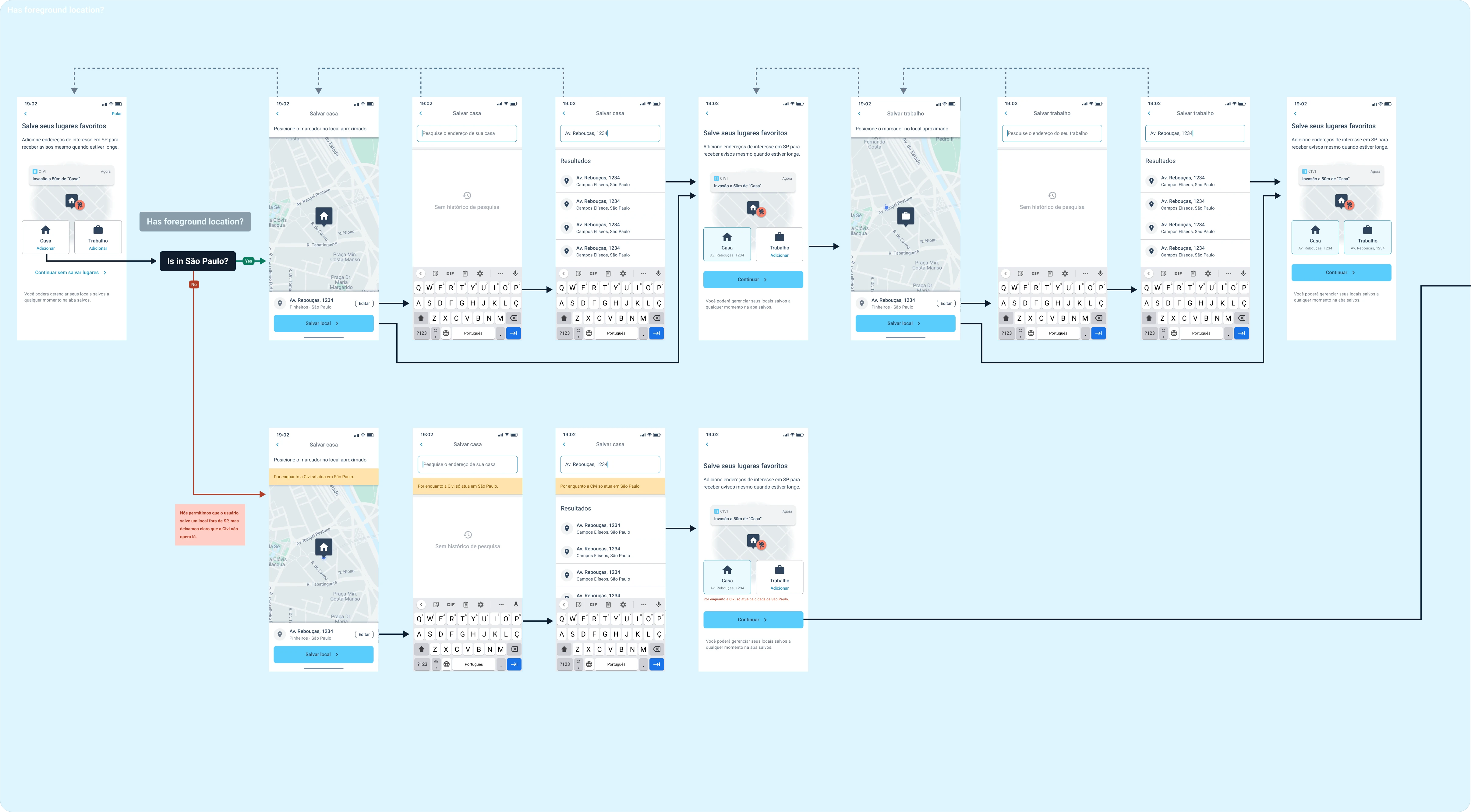
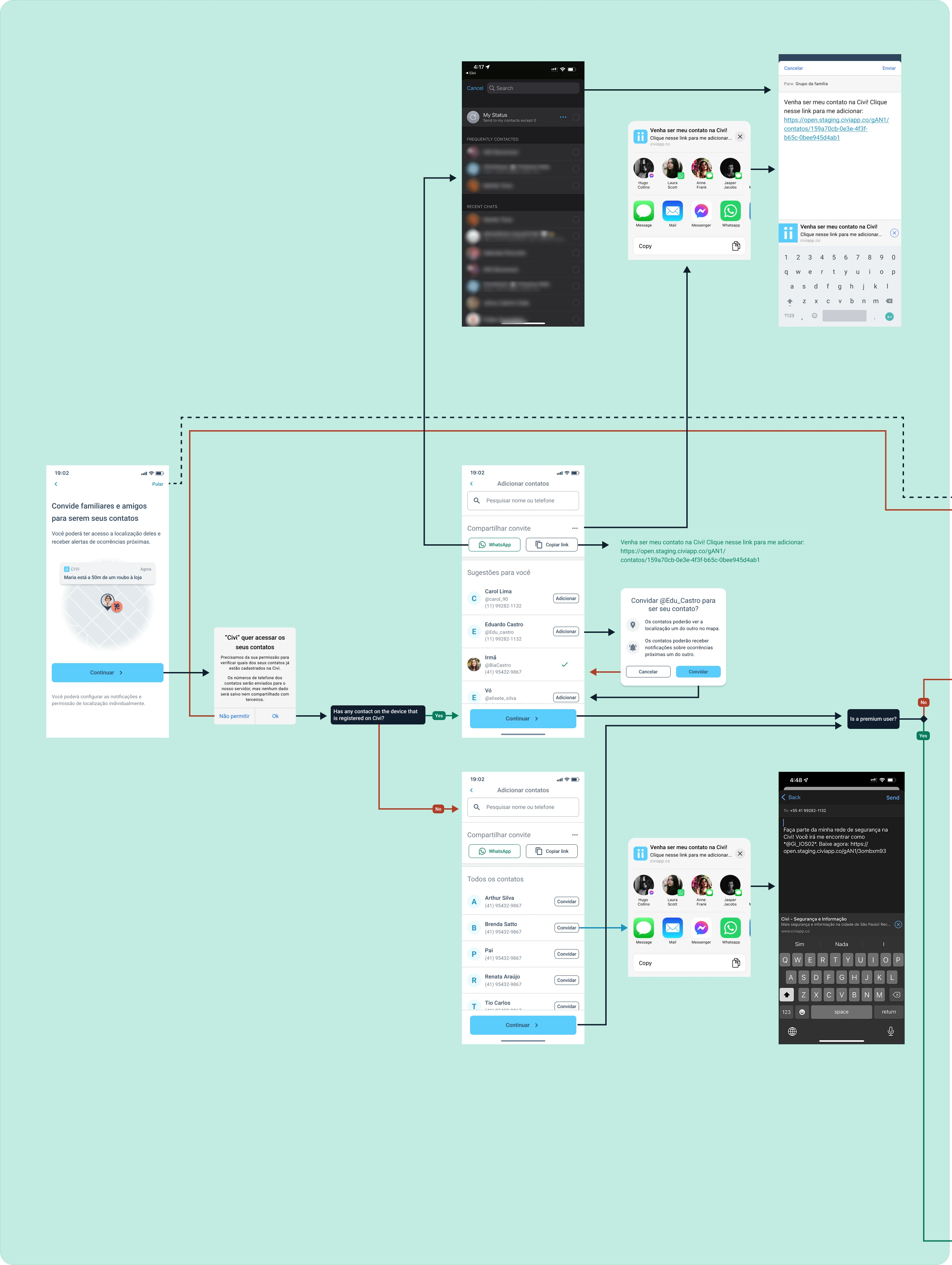
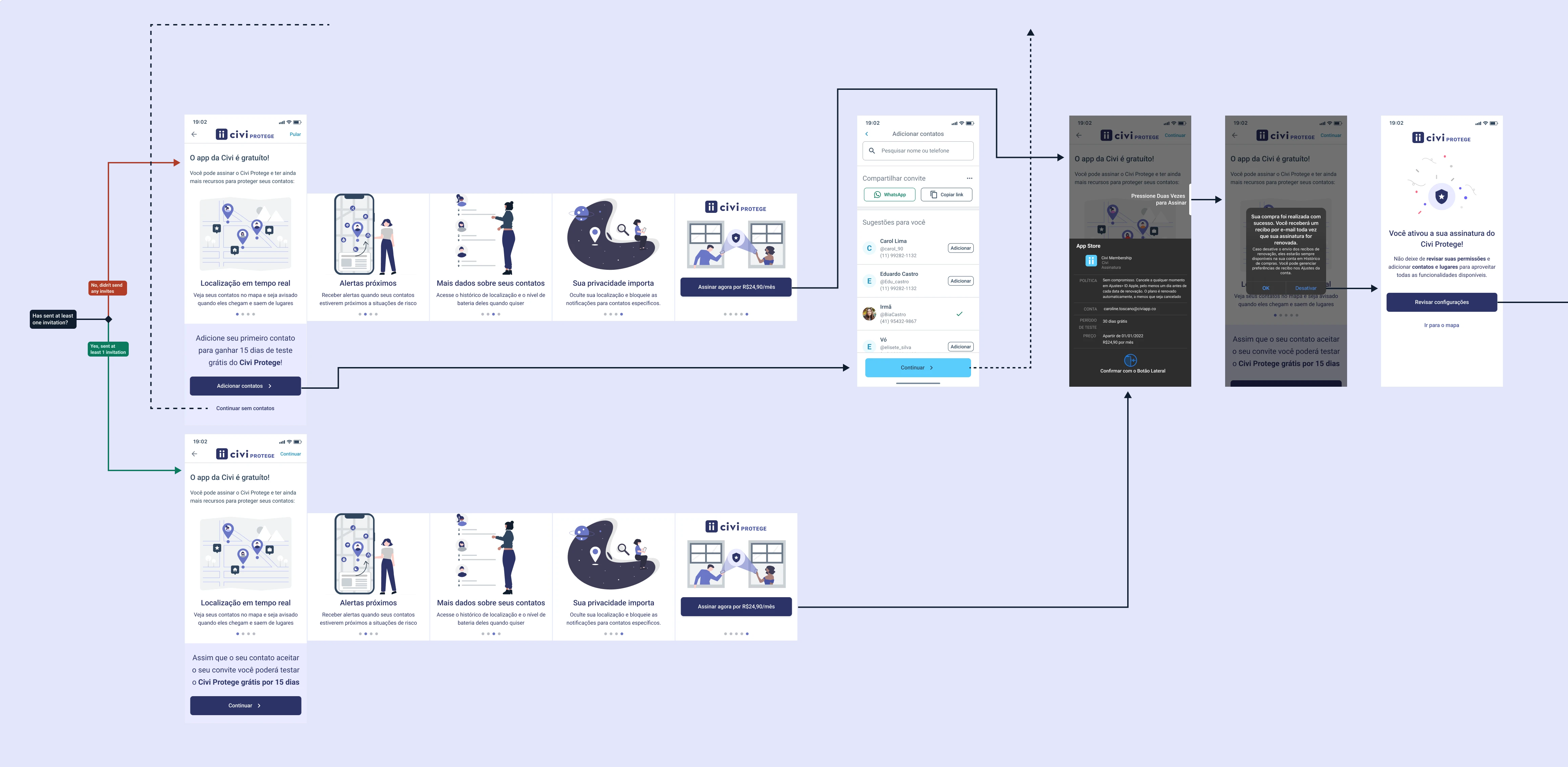
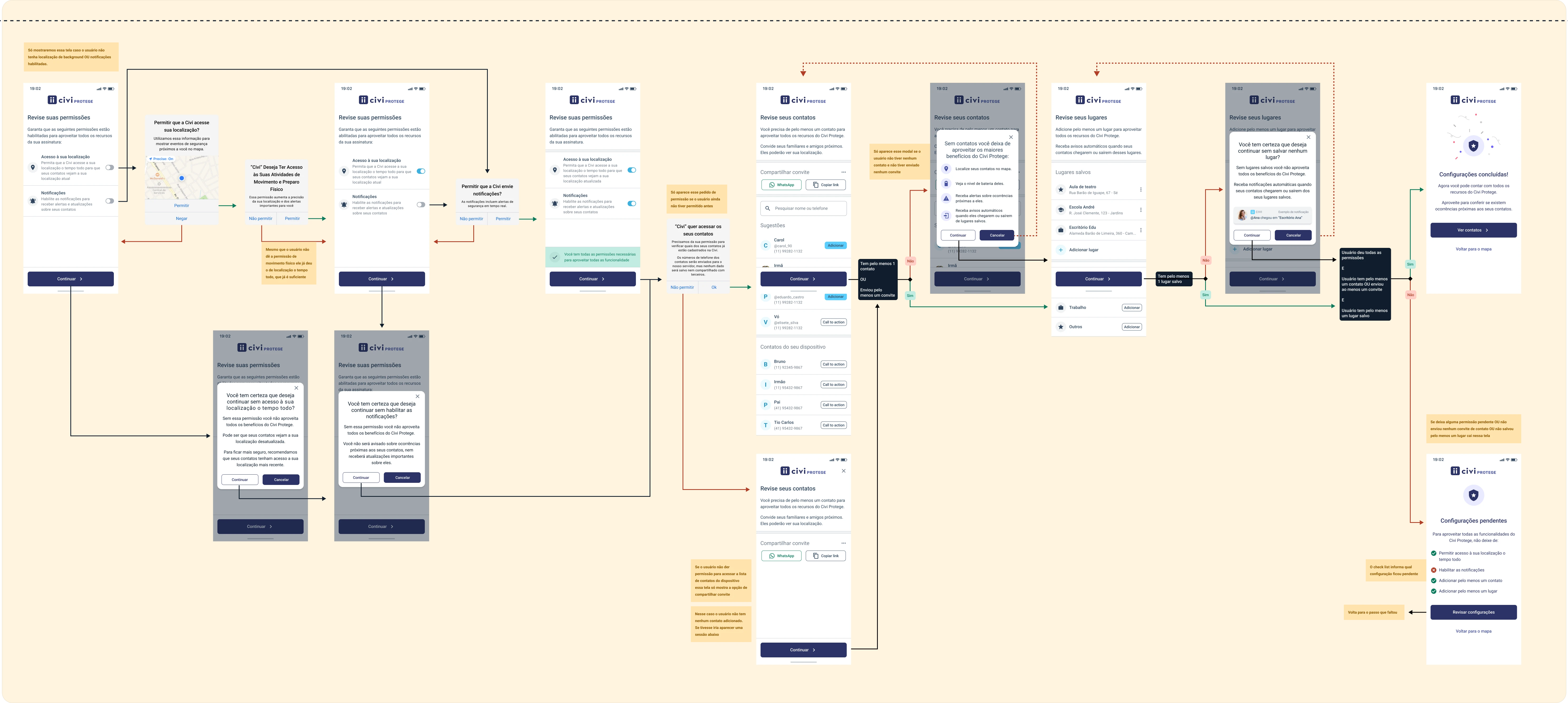
Check the flow below, or open it in a new tab →
Pending permissions and settings
Problem
Civi's value depended on device permissions like location and notifications, and on users saving places and adding contacts. Many users were finishing onboarding without turning these on, so the app couldn't deliver its full value, and retention suffered.
Solution
To fix this, I designed a pending-settings carousel and a settings review flow that explained why each permission mattered and how it kept users safer.
Virtual contact "Civiana"
Problem
Civi also depended on users adding contacts — friends and family who could see each other's location, get nearby alerts, and receive automatic notifications when someone arrived at or left a saved place. However, data showed a low rate of sent invitations, and an even lower rate of accepted ones.
In user interviews, I found that many people rushed through onboarding without reading the explanations — they wanted to finish registering as fast as possible so they could explore the app and learn by using it. Without seeing what the app could do, they had no reason to invite anyone.
Solution
To solve this, I created Civiana — a virtual contact that shows users what an added contact looks like in the app, complete with location, distance, battery level, and nearby events. I gave her a home and work address too, to demonstrate the auto-check-in feature.
This way, users could see the value of adding contacts firsthand. Contact invitations went up significantly as a result.
Places suggestions
Context
I built an auto-check-in and auto-check-out function that notifies users when a contact arrives at or leaves a saved place — for example, "Mary arrived home" or "John left work."
Problem
Users were adding contacts but not places for them — someone might add a partner but never their office, so the feature couldn't work for that place.
Solution
I added a list of suggested places, pulled from the places a user's contacts had already saved. It became much easier for users to add these places and use the auto-check-in feature.